Overall vs Groups
Last modified: December 19, 2019
.png)
The problem with overall statistics
Overall statistics that describe all of your users or visitors can be misleading. This is because the overall statistic does not show you nuanced patterns about the underlying data. As you saw in statistic vs distribution you know that distributions help you see these patterns but there are multiple ways to examine the underlying data. Another method is to group the data by different categories.
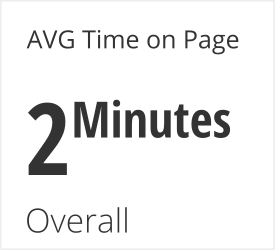
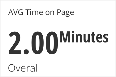
Let’s start with the same high-level statistic:
When you group this high level metric of AVG Time on Page by different countries you can see how it varies:

The AVG Time on Page is much higher for France and is lower for the other countries. Why is this the case? This is a tough question to answer since the data only shows you what is going on and not why it is happening. However, this is the right question to be asking and the sort of question that you only come to once you start grouping the data.
Common ways to group data about web site visitors:
- Country
- Age
- Gender
- Device
- Education
- Products purchased
- Start date
Create metrics for groups
Group by Category
To get a high-level metric we can use an aggregation on a column in SQL:
SELECT AVG("Time on Page")
FROM Users
To get a high-level metric broken out by group we need to add the group to the SELECT and then put it in the GROUP BY clause:
SELECT Country, AVG("Time on Page") as "AVG Time on Page"
FROM Users
GROUP BY Country
ORDER by 1 DESC
Order it by the group as well to be able to scan the data quickly for outliers.
Group by Start date
It is quite common to group data by date in analytical queries. You can turn dates into truncated strings using the TO_CHAR function. Here we will use it to truncate down to the Year and Week.
SELECT TO_CHAR(First_Visit, 'IYYY"-W"IW'), AVG("Time on Page") as "AVG Time on Page"
FROM Users
GROUP BY Country
ORDER by 1 DESC
Interpret Grouped Data
Once data is grouped, the statistics for each group vary. How much they vary can give you different ways of investigating the data
Low Variance
Grouped by Device
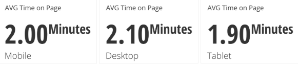
There is not a meaningful difference between these statistics and the overall statistic does a good job of representing these groups. However this might also be an indication that this type of grouping might not be the most informative. Try grouping the data in a few different ways before feeling confident in the overall statistic.
Medium Variance
Grouped by Age
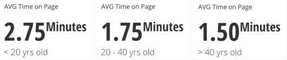
There are meaningful differences here but they still revolve around the same overall statistic. These differences might be large enough to investigate outlier groups more closely. It is a common practice to report a high-level stat and provide a margin around how much it varies. Providing this extra context can help you feel more confident in the overall statistic.
High Variance
Grouped by Country

Returning to the original example, the overall statistic is not representative of this data. Do not use an overall statistic when the variance between groups is high. You should investigate the largest outliers to determine what is going on. You can choose to isolate any outlier groups or you can perform separate analyses of the data similar to how you would address a bimodal distribution.
Simpson’s Paradox
Grouped by Gender
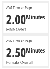
Females have an overall higher AVG Time on Page. However when we group by Gender and then by Device we see that in every category females have a lower AVG Time on Page than males.
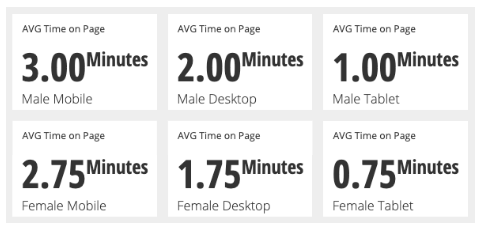
Even though females had a lower AVG Time on Page than males for every device they still have a higher overall Time on Page, how is this possible?
This is because the number of people behind each one of these AVG Time on Page statistics is different:
- The number of male visitors per device was 100 mobile, 100 desktop, and 100 tablet.
- The number of female visitors by device was 325 mobile, 50 desktop, and 25 tablet.
Since the female mobile group was so disproportionately large it dragged the average up with it in the overall statistic. This is an example of Simpson’s Paradox.
We can visualize this more clearly by mapping number of people behind a statistic with the size of a circle and increase the saturation of a color to show the increase in the AVG Time on Page:

This phenomenon is important to consider when comparing groups: you should examine what the total number of observations are behind any statistic. For scenarios like this neither the overall statistic nor grouped statistics are sufficient explanations of the underlying data by themselves. You should present all of this data so that people understand the patterns at play.
Written by:
Ben Jones,
Matt David
Reviewed by:
Twange Kasoma
,
Mike Yi