Trends
Last modified: December 19, 2019
.png)
The problem with trends
When we look at a time series chart, the size of the time period we examine can drastically alter the conclusion about whether some number is trending up, down or is relatively stable.
All three of the following graphs come from the same data:
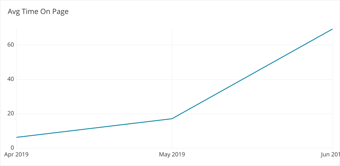
Avg Time on Page over the past day
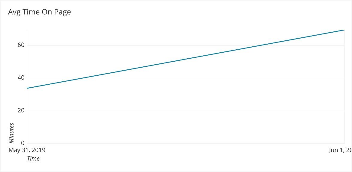
The data is moving up and to the right – things are trending up!
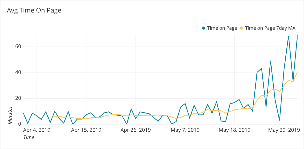
Avg Time on Page over the past week
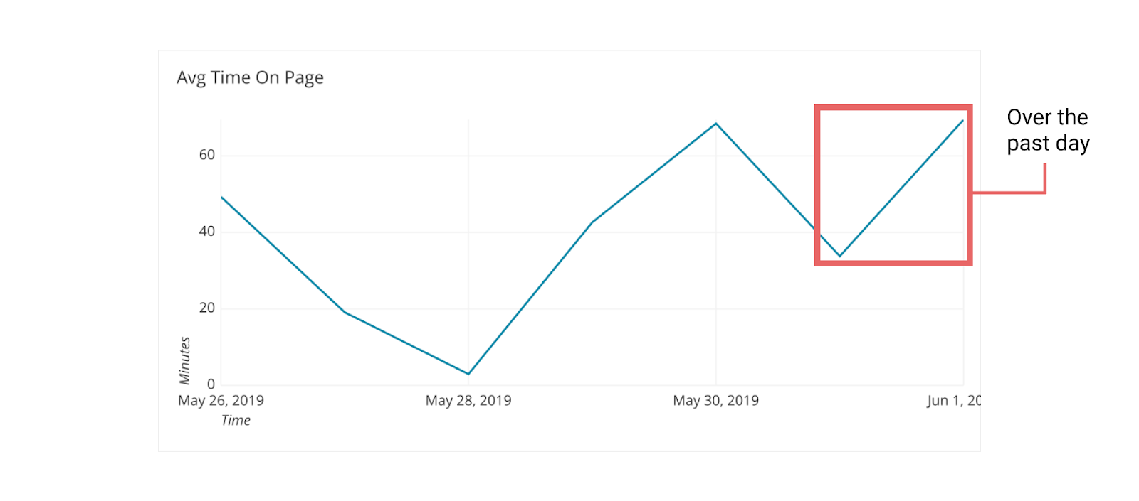
The data has been up and down the past week, we can’t be sure if the past day is part of a trend or not.
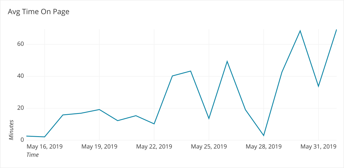
Avg Time on Page over the past 2 months
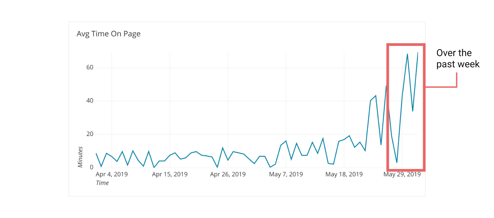
The data has been trending up recently but the variance is much higher than it has ever been.
We can tell three different stories based on how much time we include. People gravitate to the timeline that accommodates the story they believe to be true (an example of confirmation bias). Therefore it is a best practice to show as much data as possible first, try to contextualize any large variations in the data and then zoom in to specific date ranges.
Creating the right timeline
Deciding what data to show has a large impact on how people will read the chart. It is important for the reader to factor in context and variance to make their decision.
Context
Seeing what this data was in the past helps us judge the trend in the present. We can determine if this is new or something we have seen before. In the case of the example above, there is a clear trend that things are going up but variance is also increasing.
Context best practices:
- Check the data on the longest timeline you have and then move the filter up as long as you feel the data you are excluding is not relevant or could be easily summed up.
- Include access to the full timeline to add credibility to your analysis.
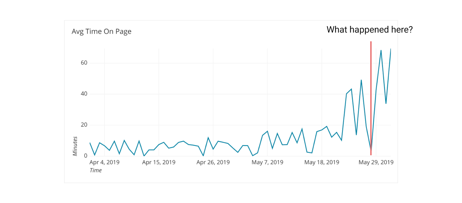
- Annotate the timeline to point out why large variations happened.
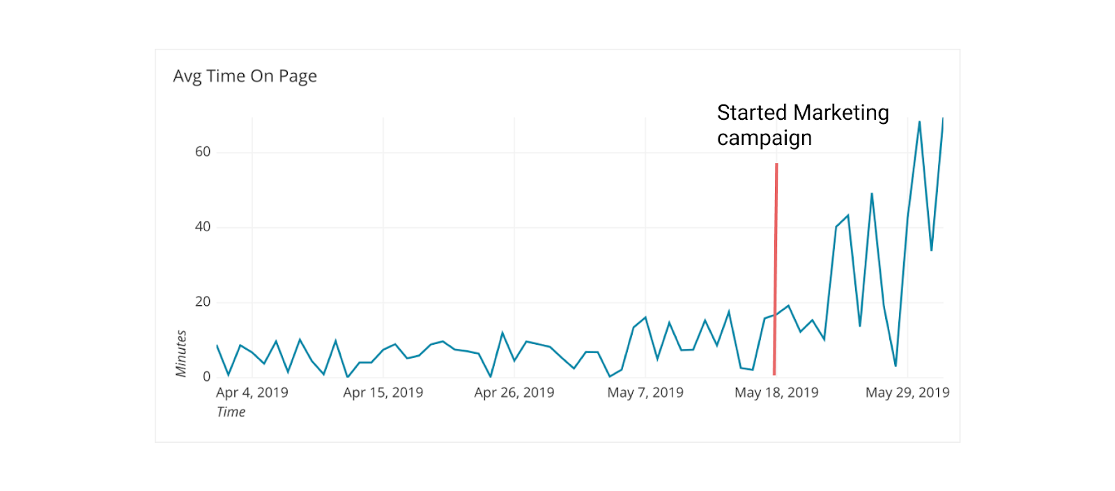
With this annotation on the chart it is clearer why this spike in Time on Page might have happened.
Variance
Variance in a line graph can be distracting or informative about the trend we are analyzing. If we take the daily Avg Time on Page chart from above and look at it by month it tells a much more general story. Time on Page is trending up:
The longer the timeframe you are aggregating, the less variance you will see in the data. The shorter the more variance. You can also reduce variance using moving averages.
Here we can see the yellow line captures the overall trend and smooths out (hides) the variance of the daily figures.
Interpreting timelines
Whenever you are presented with time series data, take note of the axes:
X-axis: Could there be more data they aren’t showing? Why?
Having seen the graph above we know there was a long period where Time on Page was low. If we cut off that previous data it no longer feels like a new phenomenon it seems like since it was first created it is trending up. The choice of cutoff point in this graph below removes that original context.
This is not necessarily bad, if you explain why the cutoff point was chosen but it can be misleading to only show recent trends in data.
Y-axis: Is the range compressing or expanding the variation inappropriately?
By increasing the y-axis range we can compress any trend to look basically flat. This is a subtle technique that can be applied to hide the size and variance of a trend.
We can look at the same chart, but increase the y-axis limit from 70 to 1000.
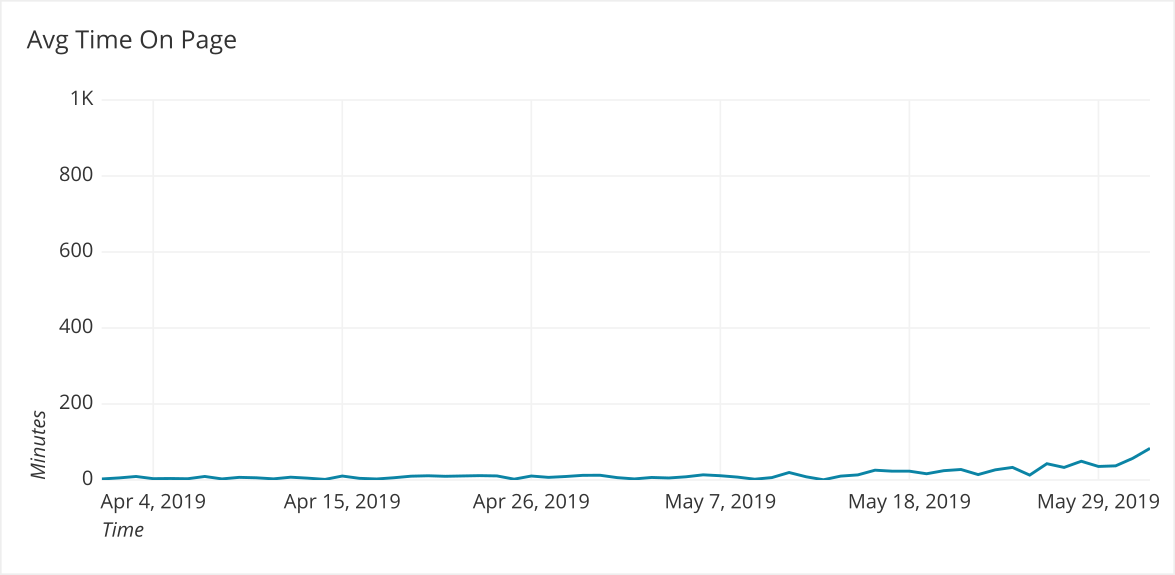
This radically changes how someone would evaluate the trend at first glance.
Annotations: Do they explain the various parts of the chart that stand out?
When a metric varies greatly it is an indication that there might have been a problem in how the data was collected or there was an outlier among very few users that dramatically affected the statistic.
Sometimes it is a true effect, but either way pointing out and addressing these points on the graph helps everyone understand it more clearly. For instance, did anything happen before the Avg Time on Page started to increase? Why did the Avg Time on Page plummet after going up?
Think through what people would be skeptical of and address it. Providing clear data is an ethical responsibility of every analyst and data presenter.
Summary:
- It is important to give context for time series data
- Try to explain any variances from the norm
- Monitor the x and y axes:
- X- Does the time period provide enough information to draw accurate conclusions ?
- Y- Is the data effectively visualized using this scale?
Written by:
Matt David
Reviewed by:
Twange Kasoma
,
Matthew Layne
,
Blake Barnhill