What Makes a Great Dashboard (ACES)
Last modified: February 15, 2020

An optimal dashboard is Accurate, Clear, Empowering, and Succinct. These key tenets can be remembered with the acronym ACES.
Accurate
A dashboard lives and dies by the trust the viewers have in what they are seeing. If the viewers doubt a dashboard’s accuracy, it will not be used to make decisions. Working with an inaccurate dashboard can cause people to be more hesitant to trust any dashboard the organization has or to do any querying themselves. A lack of accuracy in one dashboard can also cause a lack of faith in the underlying data itself.
Viewers’ belief in the accuracy of the dashboard can be affected in multiple ways:
- Data quality
- Metric comprehension
- Visualization design
Data Quality
Viewers will typically have two questions when it comes to the quality of data.
Is the data being displayed correct?
The answer to this question should always be “yes”. If for some reason the answer is “no”, immediately flag the dashboard as needing to be fixed so that viewers do not use incorrect information for their decisions. Viewers will assume any dashboard they come across to be accurate unless it is properly flagged as otherwise. Use bracketed language [BROKEN] and/or emojis to make the status of the dashboard clear.
In the list of following dashboard names we can clearly see which to avoid:
Overall Growth
Website Conversion
❌ Active Users [BROKEN] ❌
Marketing Spend
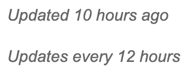
Is the data being displayed all of the data?
Most of the time it is not, because of how data is loaded into the data warehouse. Engineers use batch processing that runs on a schedule to load data from their production database to the data warehouse which is what a dashboard is typically querying. This can cause confusion to viewers who are dealing with customers or scenarios in real time because they will not see the most up-to-date data in the dashboard. If the dashboard is not displaying all of the data due to batch processing, you should note on your dashboard when the data was last updated and its schedule.
Metric Comprehension
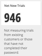
Metrics need to be understood before the viewer can interpret a chart accurately. It is a best practice to include formulas, notes, or definitions for any non-traditional metric directly on the dashboard. Placing a note directly next to the visualization provides the quickest clarification. Here we can easily see clarification around who is not included in this metric. This can also be accomplished through tool tips though they are more hidden so it is not as effective.
Visualization Design
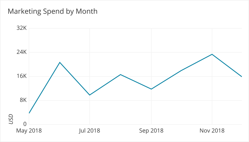
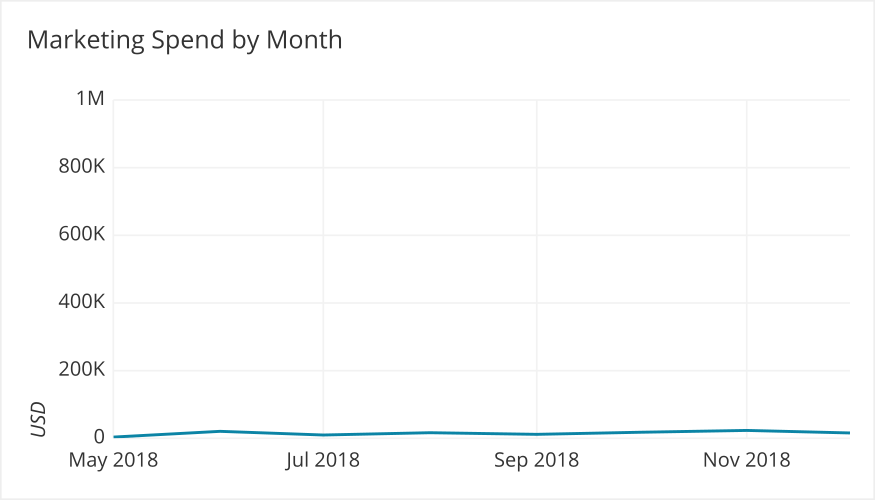
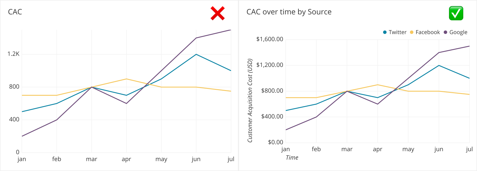
People are visual creatures and have a lot of biases in interpreting any visualization of data. A common mistake is setting the Y-axis range incorrectly. We want to highlight variation but we do not want to bias interpretation. For line graphs we do not have to start at 0 and we want to capture how the data changes; excluding the 0-baseline is fine if it is not important. It is a good idea to have the range of the line values to cover about two thirds of the vertical axis range.
Good Y-axis Range - Can clearly see the variability
Bad Y-axis Range - Cannot see the variability
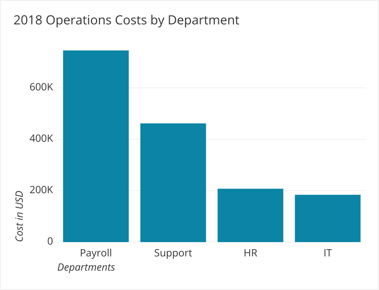
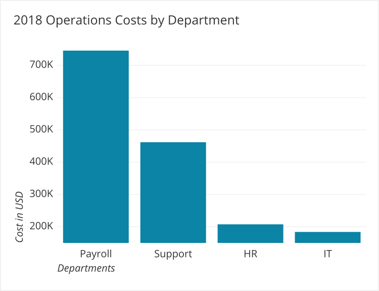
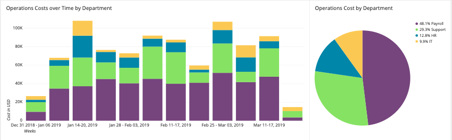
For bar graphs the Y-axis must start at 0 because if it starts at a different point it prevents us from being able to use bar sizes to judge the difference between them. When we look at the two examples below, in the first we can see that HR costs are about half of Support (Support is ~450,000 and HR is ~200,000). However, when we look at the second example, HR looks like it is ⅕ of what Support due to the axis trimming, an incorrect inference.
Good Y-axis Range - Starts at 0
Bad Y-axis Range - Does not start at 0
Clear
To be able to make a decision based off of a dashboard, the data must be displayed clearly. There are several factors that go into making the data clear.
- Fonts
- Colors
- Context
- Layout
Fonts
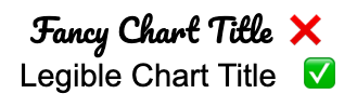
Fonts for chart titles, axes labels, and details should not be decorative. The goal is legibility. We recommend using a sans serif font such as Arial, Helvetica, or Verdana.
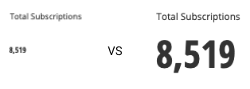
Consider the font size of any metric that will be displayed on your dashboard. Think about what type of device the audience will be viewing this on as well. All text on a dashboard should not require you to squint to read it.
Colors
Color in your dashboard needs to be used deliberately in order to maintain visual clarity. Going too far or not far will make it more difficult for the end user to understand what the data should be telling them.
Generally, you should differentiate groups through distinct hues on the color wheel. Try to avoid having overly bright colors to reduce eyestrain. Keep all of the colors in a similar lightness and saturation range so that one group doesn’t stand out too much against the others.

One exception to this is if you have two groups that are related to one another, such as if you have daily metric values alongside a rolling weekly average. Here, you can give them similar hues to show that they are related, but give one group higher saturation and lower lightness to emphasize it over the other.

If all of the groups have a sequential relationship, then you can signal this by using a continuous range of colors. Shifting the lightness from light to dark or vice versa is a common way of encoding numeric values from small to large.
When you carry the same metric or groups between charts, the colors used should be consistent. This makes it easier to form connections in the data across graphs, tables, and charts.
Most dashboarding tools include a default color scheme for clearly distinguishing between colors. If, for some reason, they do not, or it doesn’t match your data, then customize the colors so that evaluation of the data can be made at a glance.
You can find more information and tips on using color for data visualizations in the Chartio article, How to Choose Colors for Data Visualization.
Context
Without proper titles and labels it can be difficult to interpret charts. Always include information such as:
- Descriptive title
- Descriptive Axes titles
- Categorical labels
These additions make it easier for new viewers to understand what is going on.
If data is hard to decipher, it won’t be read. The more explanation or context needed to understand charts on a dashboard, the less effective the dashboard will be as an intelligence tool. Remember, speed to insight is key. Squinting is challenging and time spent seeking out the author of a report for further explanation diminishes the impact of the dashboard’s goal.
Layout
Viewers in most countries read from left to right and top to bottom. Therefore the most important information should be top left and the least important information on the bottom right.

Visualizations should be aligned. Having a chart unaligned with the other visualizations will distract from the goal of presenting all of the information clearly to the viewer.
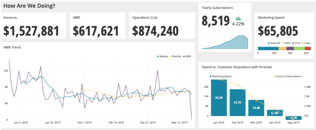
Since Yearly Subscriptions is out of alignment, it sticks out and grabs the viewer’s attention, and therefore may seem more important.
Empowering
Does a dashboard get used regularly and does it help people make decisions? These qualities are best evaluated after the dashboard is created by the end user/viewer of the dashboard.
- Do they view it regularly?
- Does it factor into their decision making?
Do they view it regularly?
Most BI tools will provide you with a query log where you can track the number of views for each dashboard:
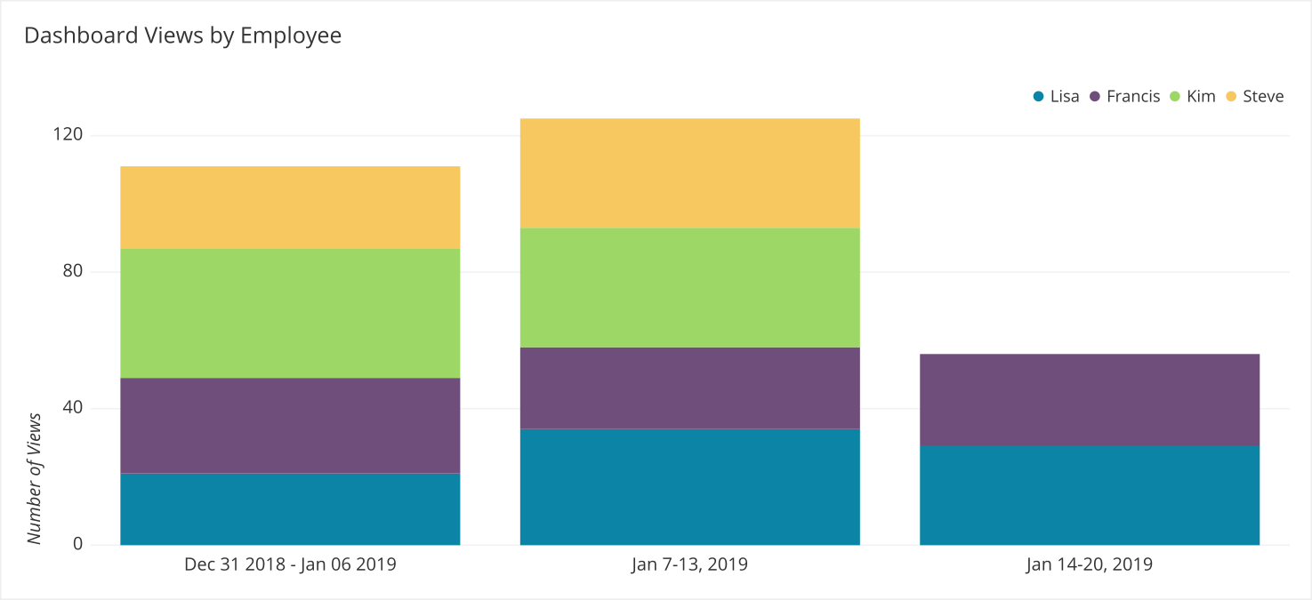
If you start to see a drop-off in views, you should follow up with the individuals who are no longer viewing the dashboard. Asking the following questions can help:
- Is the dashboard useful to them?
- Is the dashboard missing some critical information?
- What sources are they currently using to access accurate data for making decisions?
- How can the dashboard be updated to better serve their needs?
Some dashboards may be viewed less frequently if they are set up for longer-term decisions. These gaps indicate when the dashboard is not being used. The regular spikes show when it is used and how useful it is.
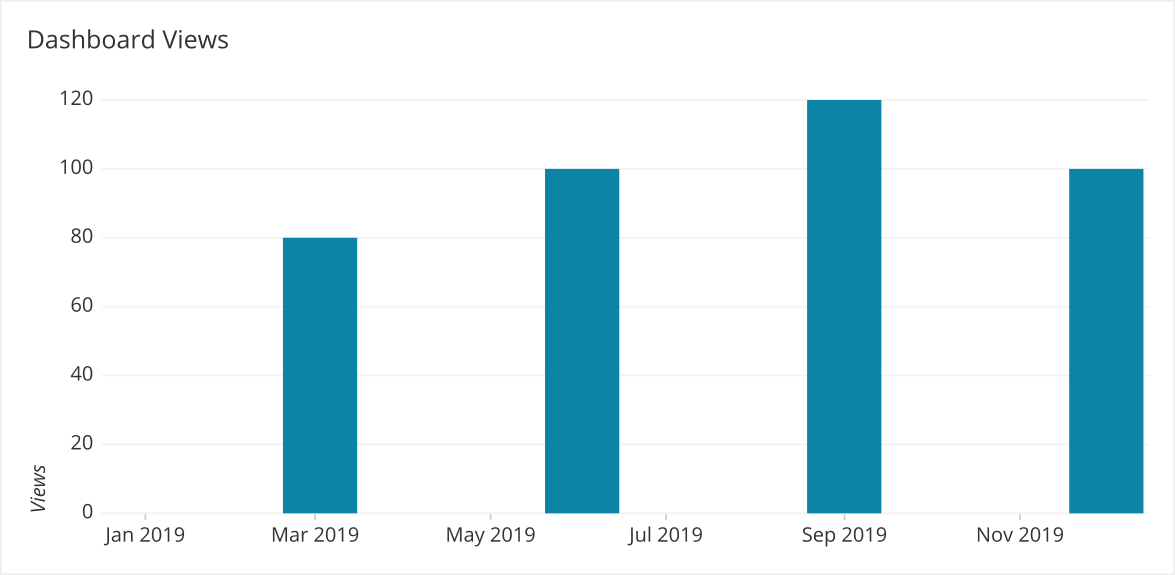
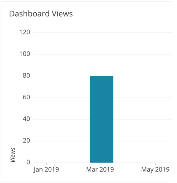
In this case, the views might be related to quarterly planning or reporting. If you were to look at the data with a shorter time frame it appears to not be useful.
Does the data displayed on the dashboard factor into their decision making?
A simple way to check this is to ask the viewer: if the numbers on this dashboard went to 0 or if the numbers doubled, would you do anything? If the answer is no, then the dashboard is probably not useful. If the answer is yes, then the dashboard is probably useful.
Succinct
One of the main benefits of a dashboard is that it shows multiple data visualizations simultaneously. This helps facilitate processing of all of the information together. Due to people’s limited working memory, the need to scroll to see other data visualizations prevents viewers from being able to reach significant conclusions. Scrolling becomes counterproductive.
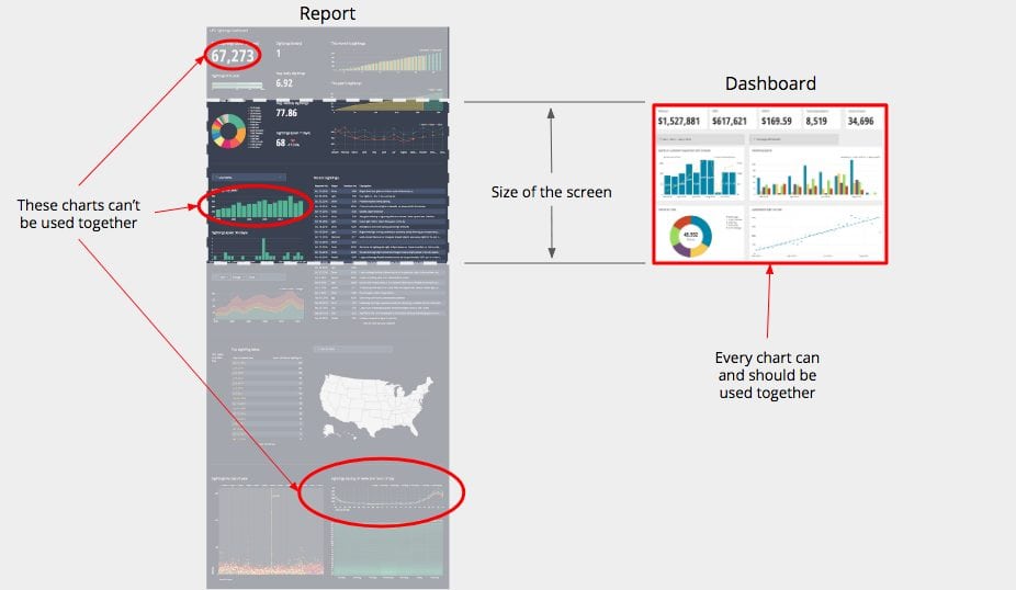
In the image below, we can see in the report on the left that it would be impossible to compare the charts that are circled at once since we would need to scroll to see each one.
Having information on a dashboard hidden “below the fold” or below the bottom of the screen usually indicates that there is too much information on that dashboard. Ask yourself if the data is necessary or if it can be displayed in a smaller space without compromising its clarity.
It is easy to keep putting more and more charts on a dashboard that are useful, however not all useful charts are relevant to the purpose of a dashboard.

While a weather forecast is useful and a Spend vs Customer Acquisition with a Forecast chart is useful, neither is relevant to each other. Placing them side by side is just confusing. Keep your forecasts separate.
Data that is relevant to other pieces of information on the dashboard should be placed in close proximity on your dashboard.
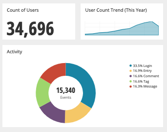
Looking back at our original dashboard, we can note the placement of relevant data succinctly which makes it easy to evaluate the data displays as a group.
Summary- think ACES
- Accurate - If the data that is visualized is incorrect or the visualization biases how it is interpreted, the dashboard becomes unusable
- Clear - clarity allows for increased speed of insights
- Empowering - will people access the dashboard regularly to make decisions (makes sure the dashboard delivers on its goal of supporting decisions)
- Succinct - keeping a dashboard brief and relevant to critical information makes it easy to evaluate all of the data simultaneously and make decisions
Written by:
Mike Yi,
Tim Miller,
Matt David
Reviewed by:
Andrew Dudley
,
Mike Yi
,
Dave Fowler