Arranging Your Charts as a Dashboard
Last modified: February 16, 2020
Arranging the charts is where the science of a dashboard project starts to cede some of its control to art. There are many things to consider when arranging and sizing charts and selecting fonts and colors. How visualizations are composed in a dashboard can either facilitate or hinder the decision making process.
Alignment & Grouping
In the dashboard that we have been working through in this book, we’ve ended up with thirteen individual charts, monitoring eight different metrics. Some metrics were monitored twice to show the current status, as well as a trend analysis over time.
When we started to create the dashboard, we ended up grouping the charts into three zones. By grouping charts and metrics that are closely associated with each other, it gives us a more coherent picture.
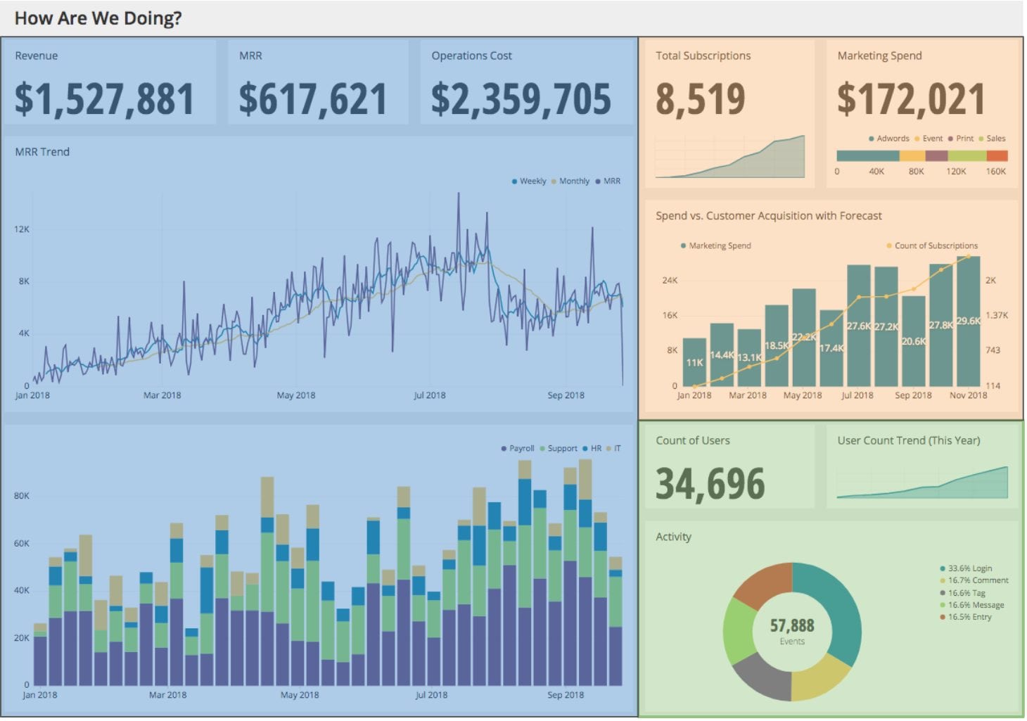
Here we can see revenue and operations metrics shaded in blue, marketing metrics shaded in orange, and user metrics shaded in green. Group charts that are about similar topics together.
Alignment Quick Tips
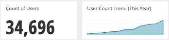
- If a specific metric is displayed in two ways, they should be placed right next to each other. For example, here we can see both the current Count of Users and how they have been trending in the past year side-by-side.
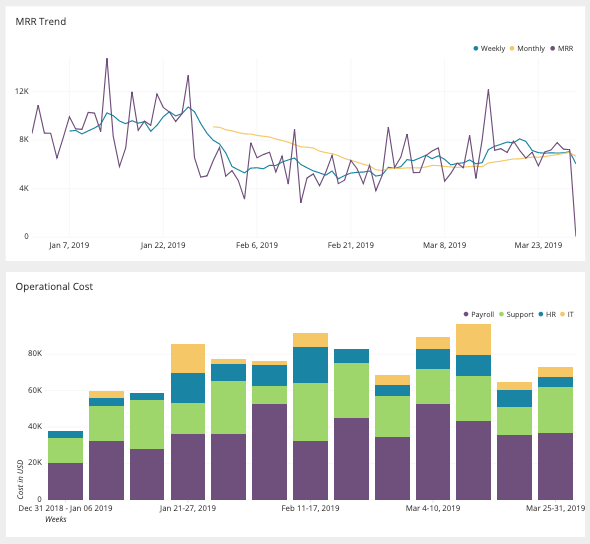
- Line charts with the same time frame should be stacked vertically to facilitate comparisons. For example, below we can see how our MRR (Monthly Recurring Revenue) compares to our operational costs by department.
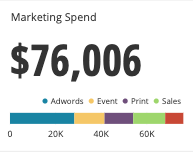
- Put items next to each other with no separation to use the same title for both visualizations. Here you can see that there does not appear to be any separation between these two visualizations. This groups the data and makes it clear they are describing the same thing.
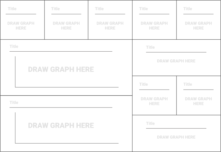
Examine Layouts
Determine the aspect ratio of the device (iPhone, laptop, tv, etc) the dashboard you are building will ultimately be delivered on by consulting with the Point Person. View our templates to get ideas about how you could compose visualizations together.
View more here: Dashboard Templates in Figma
Also now is a good time to use Google to search for example dashboards and apps that you use with a dashboard interface to get inspired about what combinations work.
Here is a great layout used by Google Analytics:
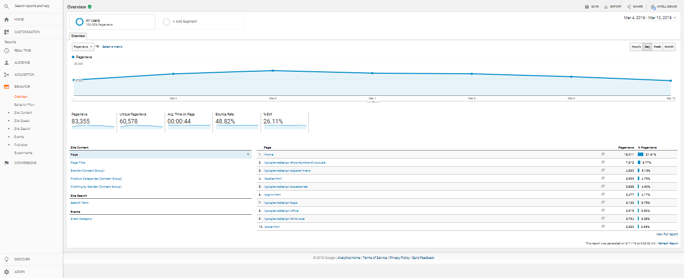
https://medium.freecodecamp.org/how-and-why-to-get-started-with-google-analytics-153dc35b7812
While being innovative in dashboard design can challenge the way we look at things in a positive way, too much innovation is also likely to confuse your audience. Stick with simple arrangements that don’t violate the ACES dashboard design qualities.
Limited Variety
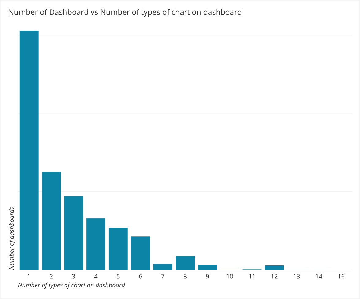
At Chartio, we have also noticed that dashboards with multiple chart types get more views up to a point. While there are less and less dashboards created with more chart types as we can see here, with a sharp drop off after 6 different types:
The average viewership peaks when six different types of charts are used:
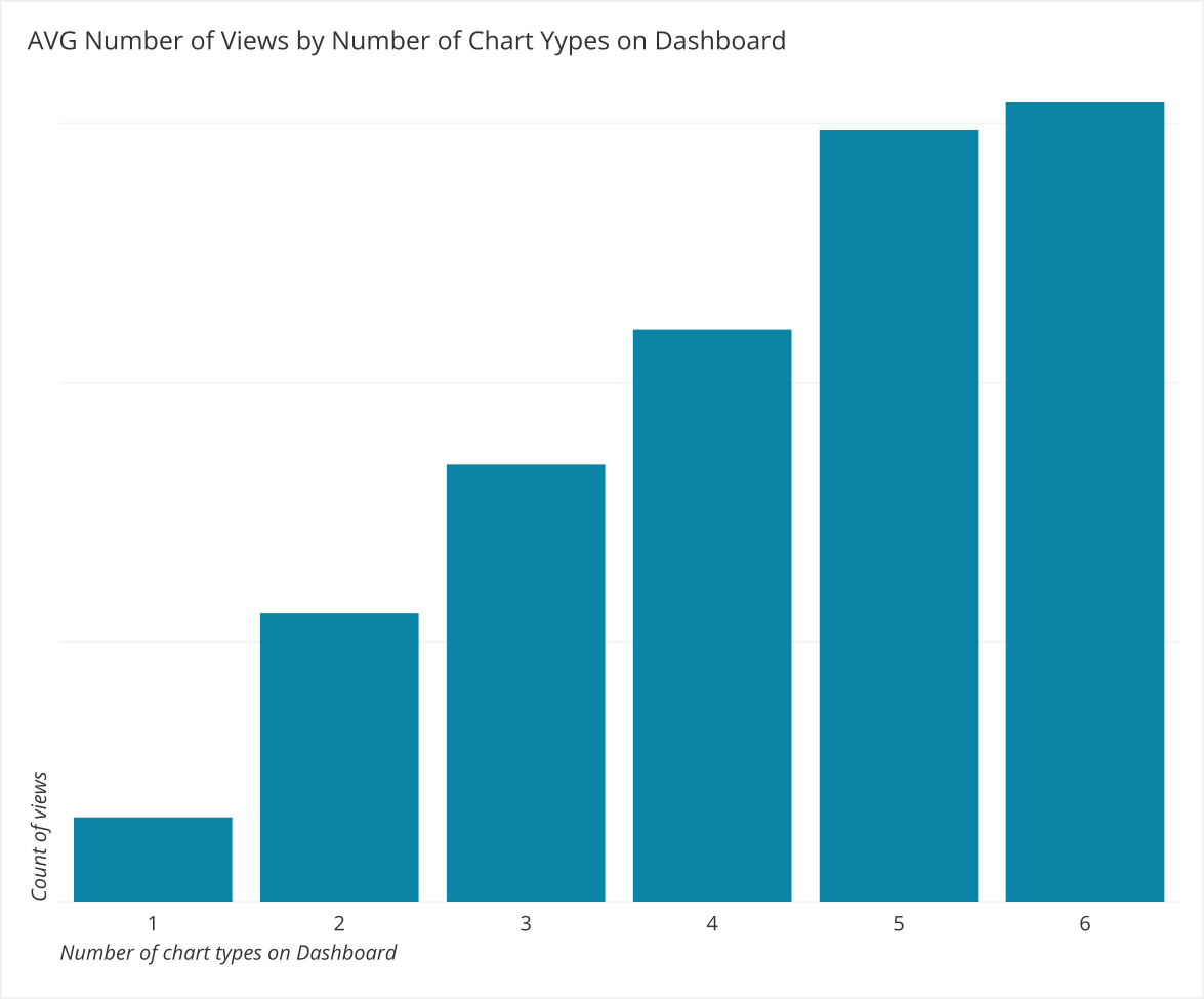
We did not include average viewership above 6 chart types due to the outliers present in dashboards with more than 6 chart types.
Avoid Too Much Information (TMI)
In addition to using an appropriate number of chart types in your dashboard, remember to not include too many visualizations in your dashboard. There will be many opportunities to overload the dashboard with too much information. Information overload deteriorates the power of the dashboard. Users will have a difficult time finding what they need if there’s too much information to sort through.
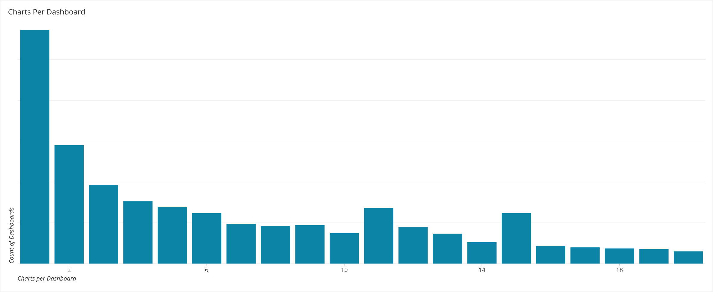
At Chartio, we took a look at the number of visualizations per dashboard and found that it is heavily skewed. The vast majority of dashboards only include a few charts, with a very long tail past a dozen charts:
However it is important to note that the average number of views of dashboards with more charts does go up.
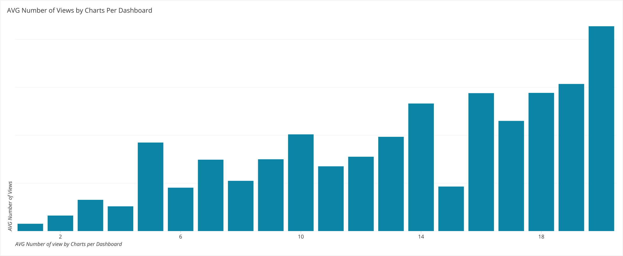
So while this may seem in conflict with our original statement about avoiding too many chart it does not. The average amount of views trending up with more charts means people want more information. Dashboard owners are adding on more and more charts to existing dashboards as they go. Instead they should step back and follow a dashboard design process to isolate new decisions that need to be made and to create a new dashboard for it.
If information needs to be viewed as is and aggregated at a more granular level, you should create a second dashboard containing this drilled down view. Don’t be afraid to link out to other dashboards. This preserves the core decisions and goals of the dashboard at hand and lets people explore the data in more detail if they wish.
Summary
- Align visualizations to facilitate comparisons.
- Group visualizations to facilitate insight.
- Familiarize yourself with various dashboard layouts to help develop useful arrangements for your own dashboard.
- Be wary of overly flashy dashboard arrangements made possible in BI tools.
- Do not overcrowd the dashboard with too many visualizations. Link out to provide further investigation where appropriate.
Written by:
Tim Miller
Reviewed by:
Mike Yi
,
Dave Fowler
,
Matt David