What is a Dashboard?
Last modified: February 15, 2020
Anytime you want to display information to help people make more informed decisions, you should consider designing a dashboard. A well designed dashboards allow us to arrange multiple data visualizations to provide enough context to make informed decisions.
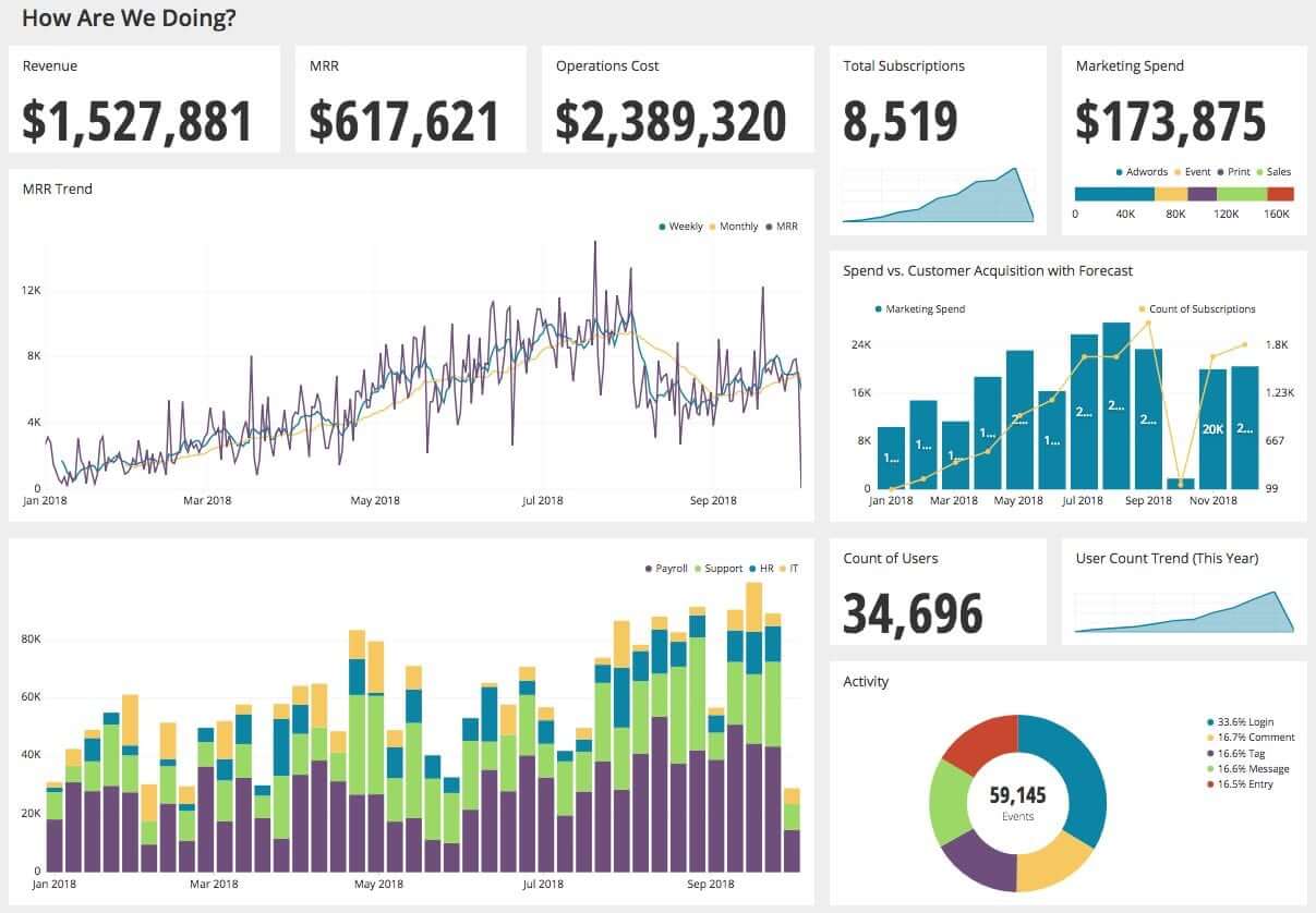
For example, this is a dashboard tracking the top metrics for a SaaS company. It provides at a glance information related to revenue, operating costs, total users, and other relevant data that can be evaluated.
This dashboard can help the CEO or anyone in the company figure out what is going on at a high level, and help them decide where to focus.
“My operations costs are higher than my revenue, I need to reach out to my COO to get informed about why we are spending so much.“
In this case shown above the data is helping the CEO to decide to focus on looking more into costs.
This dashboard is composed of various data visualizations to provide the viewer context to support insights and make multiple decisions. An effective dashboard is also dynamic — as the underlying data changes, the dashboard is automatically updated so that time sensitive insights and decisions can be made.
This book will explore best practices to create useful dashboards such as this one to help individuals make informed decisions.
History
The term “dashboard” originates from a board that was built into carriages to block the dirt that the horse would dash up. When carriages became automobiles, the dashboard remained relevant to block dirt dash-ed up by the front wheel. When the design of automobiles shifted to putting the engine in the front, the dashboard’s purpose grew to protect the driver from the heat and oil. The dashboard also became a convenient location to put gauges to monitor the engine’s performance and other data points about the car such as fuel levels.
The term dashboard jumps to describing the modern day business tool this book is all about due to Microsoft. Microsoft is given credit for promoting the term as part of their Digital Nervous System concept in the 90s.
The modern day business dashboard has its origins in research that started in the 1970s to use computers to help people make better decisions. Originally known as Decisions Support Systems they became initially commercialized as Executive Information Systems. Now these tools are ubiquitous in business to track performance and help people make informed decisions.
Dashboard Value Proposition
Let’s begin with that very common dashboard that billions of people use every day, the dashboard in a car. Think about the type of data that is displayed. This dashboard presents how fast the car is going, the RPM, the oil temperature, and how much gas is left. Not to mention warning symbols, information about gears, and whether or not your lights are on. It provides all things you need to monitor in order to do your job, in this case driving your car safely.

The data displayed to the driver helps them make important decisions about speed, engine health, and if they need to go to a gas station. Dashboards such as this allow people to make informed decisions.
Single Visualization Dashboards
However, let’s imagine a dashboard in a car that only showed one of these data visualizations
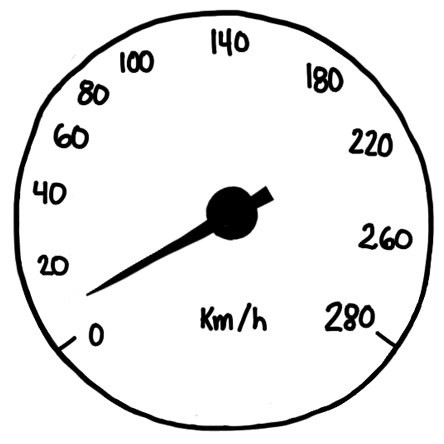
We might know how fast we are going but we could run out of gas at any minute. Seeing a single chart to make all of your decisions from is dangerous. Unfortunately, this is often how people encounter data, in a single chart. The data is isolated, lacking context and other important information required to make a good decision.
A news report might show the job market of the United States in a single chart:
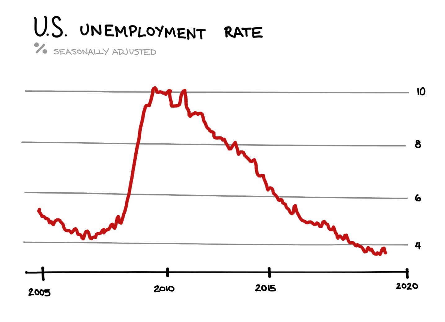
At first glance this looks great, the unemployment rate is around 4%. You might conclude that it is easy to get a job and decide to quit and look for a new one. While this graph could be useful to help determine if I should look for a better job, it does not paint the full picture. One visualization alone should never give anyone much confidence. There could be critically important data that is missing if you only consider one visualization.
Multiple Visualization Dashboards
If that chart was part of a dashboard that included multiple visualizations about the job market, it would be easier to make a better decision. Let’s add another chart:
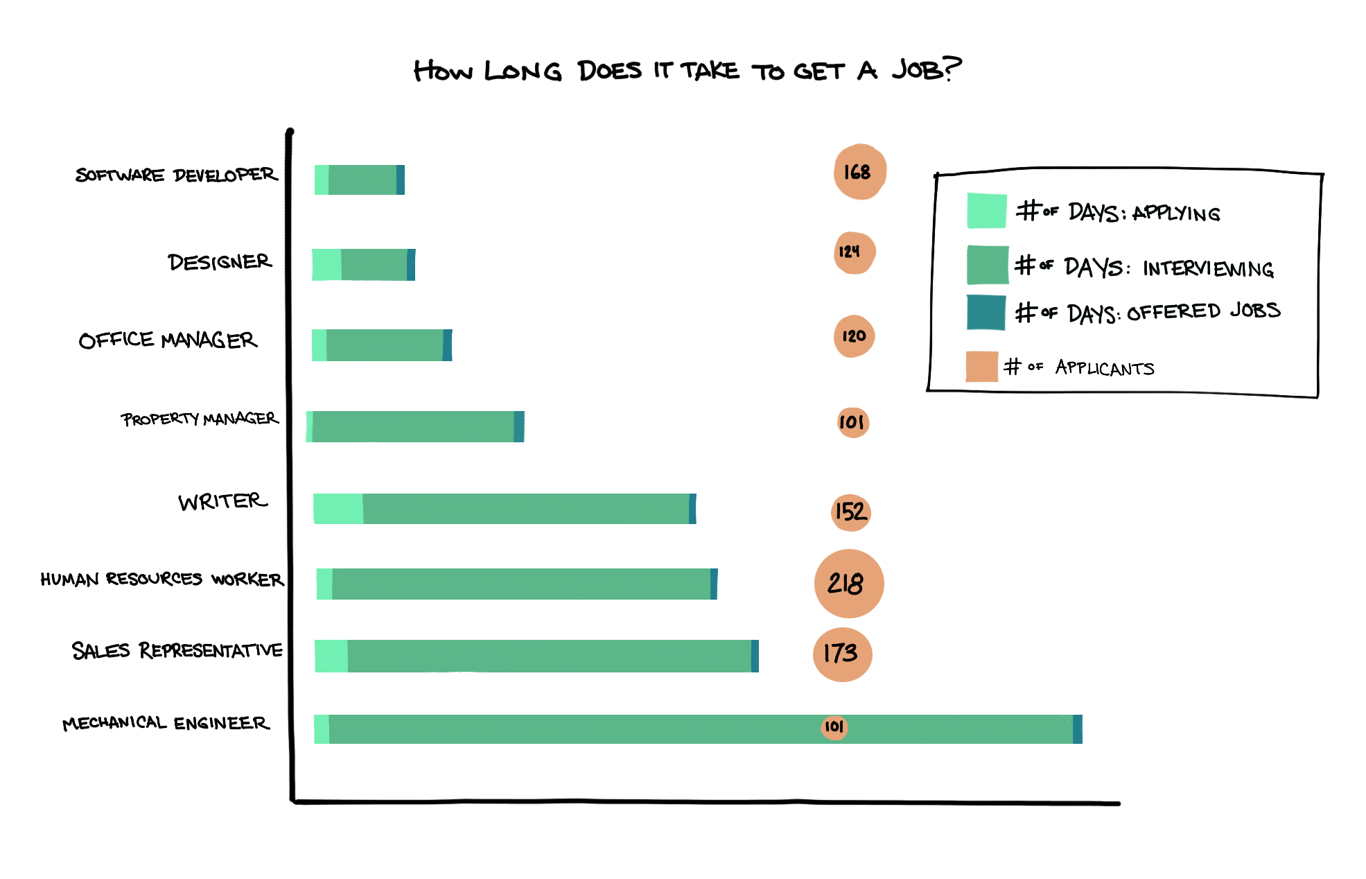
Here we can see the length of time it takes to get a job broken out by field. While the first visualization signals it is a good job market, the second indicates which field will be the quickest to get a job in. This is the beginning of a dashboard to support the decision of if I should look for a new job. Dashboards are composed of multiple visualizations so that the person can be well informed before making a decision.
How do dashboards get used
There are many types of decisions that need data to support them. Random one-off scenarios, regular budgeting decisions, and operational prioritization. Each type demands a different point of view, let’s dive into each.
Ad Hoc Analysis
Ad hoc analysis is useful for clarifying your own thinking or exploring anomalies in the data. This type of effort rarely involves any amount of planning or design. People quickly begin writing queries and choosing simple visualizations to look at the data. They may choose to explore the question in a few different ways which means that multiple (unoptimized) visualizations are brought into the dashboard. This dashboard typically has an audience of one (you) or when shared with others is accompanied with a write up or verbal explanation for how to interpret it.
Strategic Planning
Strategic planning dashboards are for large projects or large decisions that require a lot of static historical data to make the best decisions. They combine multiple views of how the business has been performing and compare it to competitors. Since they present a static view of the data it typically only provides value for that specific strategic planning effort. While these are extremely useful this is not the most typical use case for dashboards.
Ongoing Decision Support
The strongest use case for dashboards is to support ongoing decision making. The data powering these visualizations is regularly updated or almost live and it helps people make good decisions multiple times a day. These dashboards are designed for the audience who will be using it, and is updated as use cases shift. Ongoing decision support dashboards will be the focus throughout the rest of the book.
Let’s revisit the original dashboard which is a decision support dashboard:
- Revenue - Payment provider such as Stripe
- Cost - Accounting software such as Quickbooks
- User Count and Activity - Your production database using tools such as Segment
Everyone wants to make informed decisions based on data. Organizations have more data available than ever before, and dashboards such as this one allow people to leverage all of the data in context for effective decision making. This book will guide you in constructing useful dashboards for making decisions.
Summary
- Dashboards display information used to support high quality decision making
- People leverage data all the time to make important decisions in their personal lives and in their organizations
- There is more data available than ever before within organizations
- Dashboards help individuals make informed decisions based on multiple sources of data within an organization
Written by:
Matt David
Reviewed by:
Andrew Dudley
,
Mike Yi
,
Tim Miller
,
Dave Fowler