Dashboard Prototyping and Feedback
Last modified: February 19, 2020

From Principles to Practice
We have reviewed the different types of data visualization and how they might best fit different types of metrics. We have also covered best practices for arranging and composing a dashboard. Now it is time to dive in and start creating concepts for your own dashboard.
Review
Gather your documents stating the goal, decisions, and metrics in one place. Do a quick review to make sure you understand all the requirements for the dashboard.
Now it’s time to put pen to paper. In a typical design process, the prototyping stage involves heavy divergent thinking to explore a wide range of solutions. In a dashboard design process, the output is normally constrained to a few chart types. This means that you can start sketching pretty accurate designs right away.
Sketch
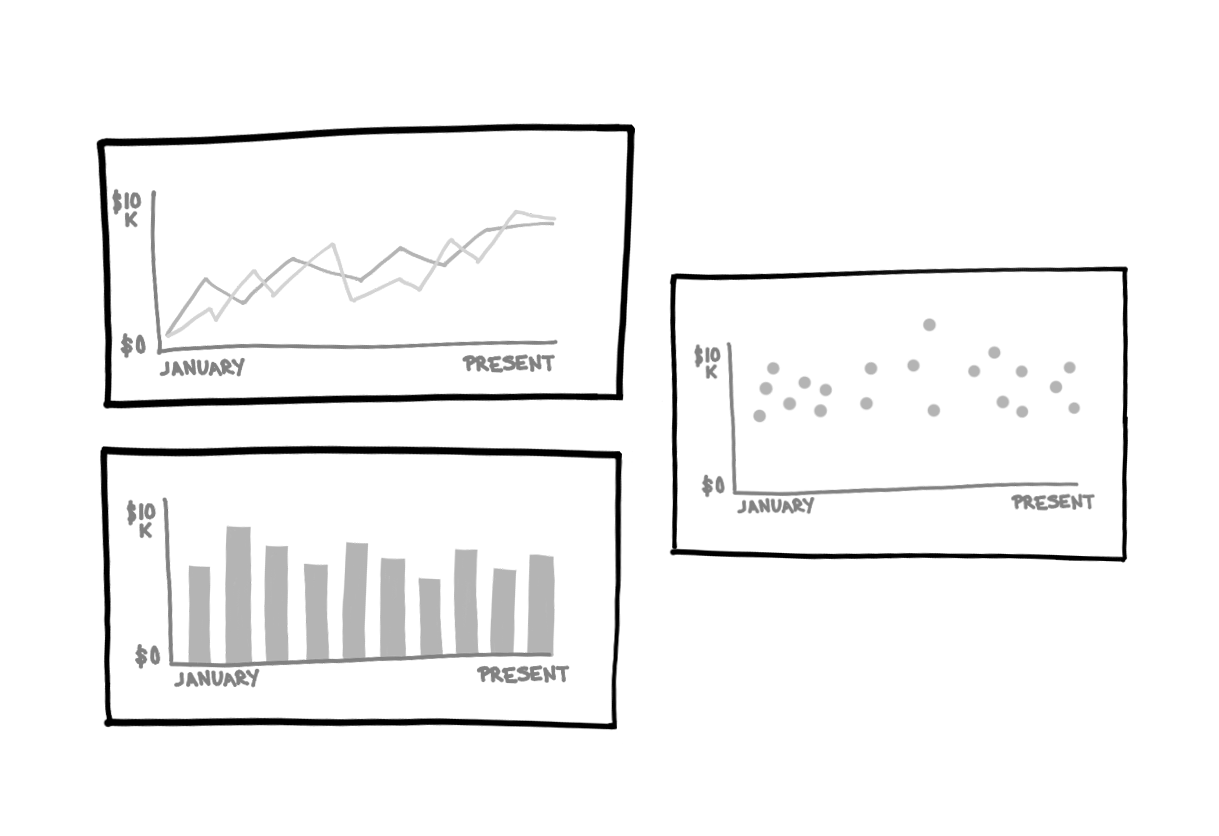
Start with individual metrics and draw them as visualizations. Try to draw them aggregated and grouped in different ways.

Keep asking yourself:
- What decisions does the audience need to make?
- What does the audience need to know in order to make those decisions?
It is common to have new ideas for metrics while sketching. Go ahead and sketch them and then evaluate whether they serve to inform the decisions that need to be made from the dashboard. If you do end up keeping them, go back and fill out the Metric Spreadsheet with the details so that you can easily build them later on.
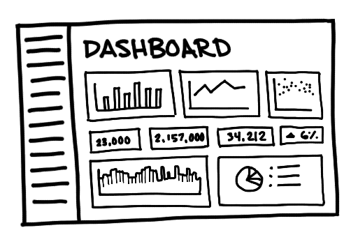
Then try drawing multiple visualizations together.

As you sketch out different combinations of visualizations for the dashboard try to limit the number you use in each attempt to as few as possible. Start by asking if you only had one chart, which would you use. Repeat the same process for two, three, or more charts. This will help you determine which ones should be prioritized visually.
Feedback
Ask the Point Person for feedback on the sketches. Would your sketched dashboard better inform their decisions? Ask other members of the final audience for feedback at this stage. Changing a sketch is relatively easy compared to querying for new data.
Sometimes people will be hesitant to provide feedback. There are a few easy tricks to getting them to give five actionable critiques. Ask the following questions for each visualization:
- Restate what are the decisions that they will be making based on this dashboard?
- Do they need to know this information to make their decision?
- What else do they want to know about this metric?
- Is the conclusion they can draw from the visualization obvious?
- Would this metric change their decision if it was much higher or much lower than is normal?
Ask the following questions for the whole dashboard:
- Does this dashboard support the decisions and goals of this project?
- Which visualization grabs the eye first? Should it?
- Should any of these visualizations be grouped together?
- Is anything missing from the dashboard?
Iteration
Be open to feedback. The goal is to create a useful dashboard for the audience, not to convince people your design is great. You will likely need to do more than one round of prototyping, feedback, and iteration to find the right mix of visualizations.
After you feel confident that the dashboard contains the relevant information to help support decision-making, you are ready to bring the various charts to life.
Written by:
Matt David
Reviewed by:
Andrew Dudley
,
Mike Yi
