Dashboard Design Process
Last modified: February 11, 2020
The dashboard design process is very similar to any design process – the output in this case is simply a dashboard.
Why the Design Process is Important
People get very attached to solutions they come up with for a given problem. The more they invest time and effort into their solution, the stronger they believe in it regardless of how well it actually solves the problem. This is why it is critical to avoid jumping right to solving a problem by building a dashboard. We don’t want dashboards that don’t solve the problem well because they will not be used.
Spend time understanding why we are building a dashboard and give ourselves time to explore multiple ideas before selecting a solution that we will actually build.
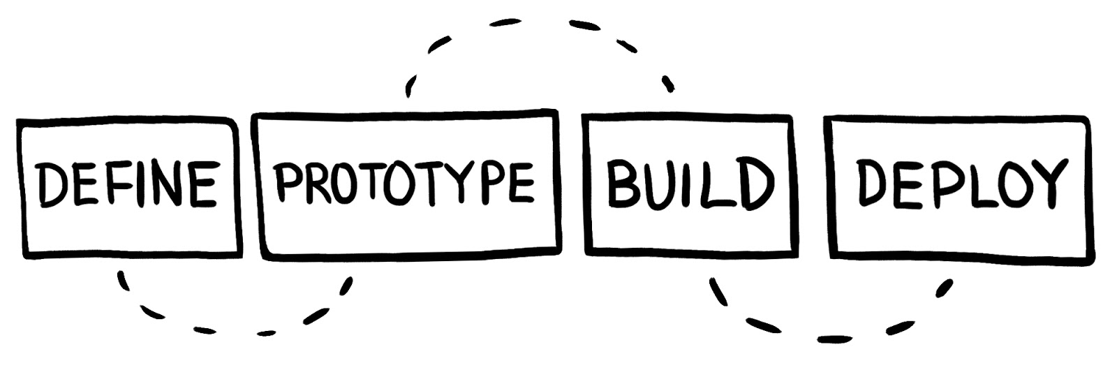
The dashboard design process starts with defining our stakeholders and determining what decisions they need to make, we then determine what metrics would support those decisions. Next we prototype dashboards with pen and paper, get feedback, and iterate. After verifying that the prototype meets the goals of the project, we need to find the actual data and build the dashboard. Finally, we need to share the dashboard and maintain it so it becomes a useful tool for the audience.
Dashboard Design Process
We can summarize this process into four steps:
- Define
- Prototype
- Build
- Deploy

1. Define

This is the first and most important step. Having clarity about who this dashboard is for and what metrics matter to them is critical to creating a dashboard that will be used.
Stakeholders
There are 4 main stakeholders
- The designer (you)
- The audience (who will be viewing this dashboard)
- The point person (the member of the audience who has the most experience)
- The Data Gatekeeper (member of the data team who will help with the database)
We will define their responsibilities and where they factor into the process in the next chapter, Identifying Key Roles.
Metrics
You will work with the point person to go from decisions that need to be made to metrics that can be queried and tracked. This process involves a lot of back and forth to weed out interesting but ultimately not relevant metrics to mission critical data for decisions to be based on. We will go into further details about how to do this in Determine the Metrics to Monitor.
2. Prototype

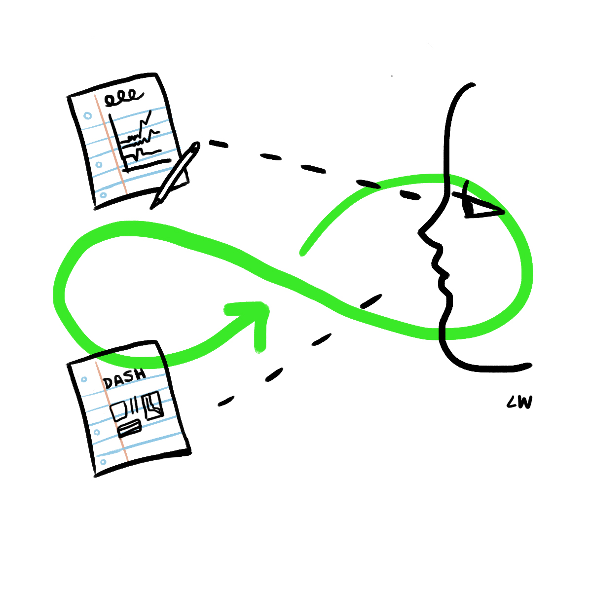
Once we have the metrics that we want to put in a dashboard, we need to figure out how to best display them so that the dashboard is useful to the whole audience.
Visualizations
Use visualizations that present the metrics clearly and accurately. Even when sketching and prototyping graphs, making the right visualization decisions here will improve the prototype and the feedback loop. We will cover when to use which chart in depth in Find the Best Visualizations for your Metrics.
Dashboards
There are best practices for taking the visualizations and composing them together in a dashboard. In fact, some composition choices might actually make you change what visualization you had selected as optimal before. We cover best practices for arranging dashboards in Arranging your Charts as a Dashboard.
Sketching and Iteration
At this stage, it is recommended that the visualizations and dashboards be sketched out on paper or using a lo-fi tool that is not connected to any real data. The reason for this is that it allows you to quickly throw out bad ideas without worrying about the time investment. It also allows you to focus on design instead of checking if the numbers are right. We talk through visualization and dashboard prototyping strategies in Dashboard Prototyping and Feedback.
3. Build

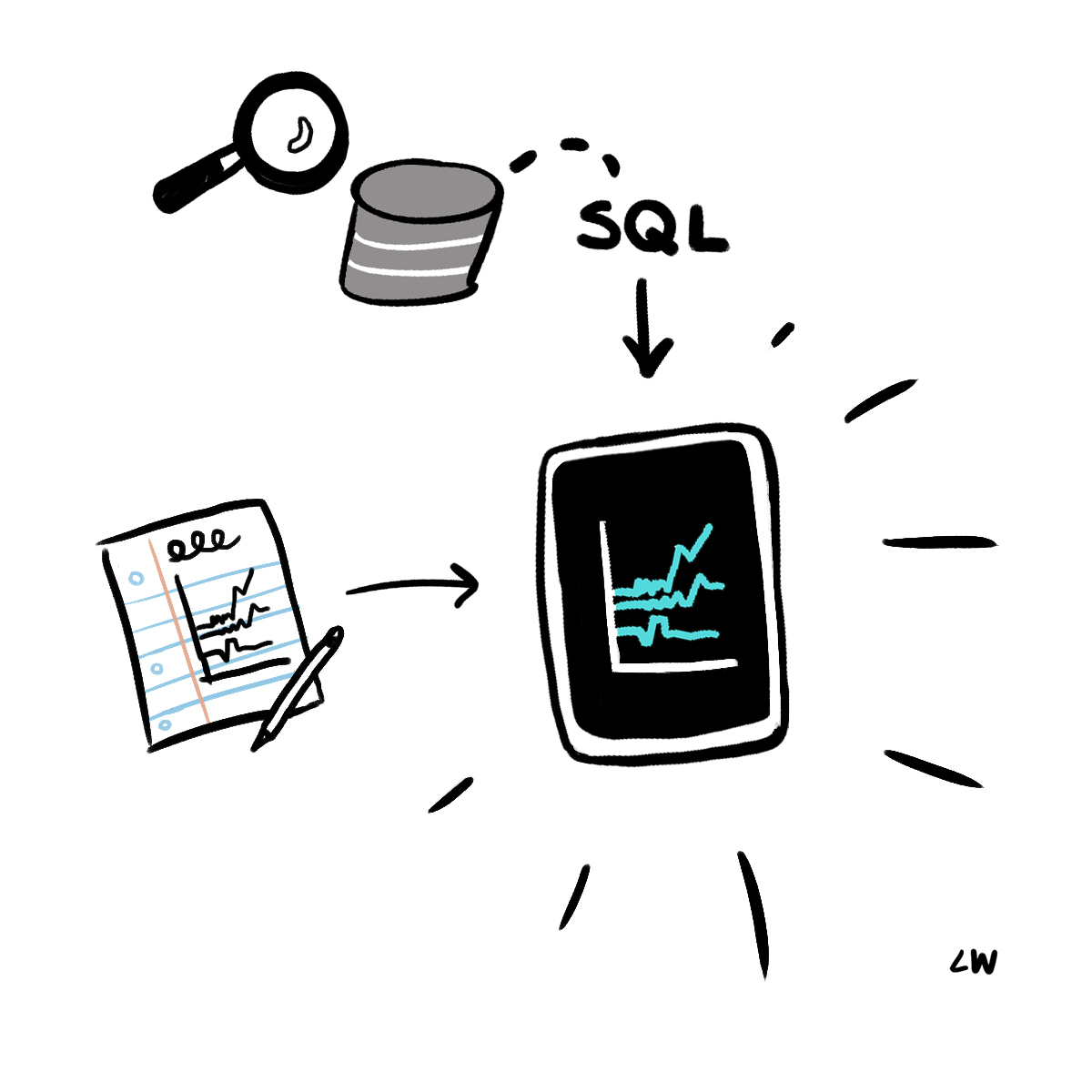
Once we are satisfied with the prototype we have to create the dashboard using real data.
Find the Data
Many challenges can arise at this point. Where is the data stored? Is the data messy? Do we even have the data available? Working with the data team and the Data Gatekeeper is critical to navigating this step. We talk through common difficulties and how to overcome them in Finding the Data that Builds Metrics.
Build Metrics/Dashboard
We need to create queries to power the metrics, create formulas, and transform the data into charts. Using a framework to log the metrics, formulas, and data sources makes creating queries much easier. We outline how to do this best in Build the Metrics.
4. Deploy

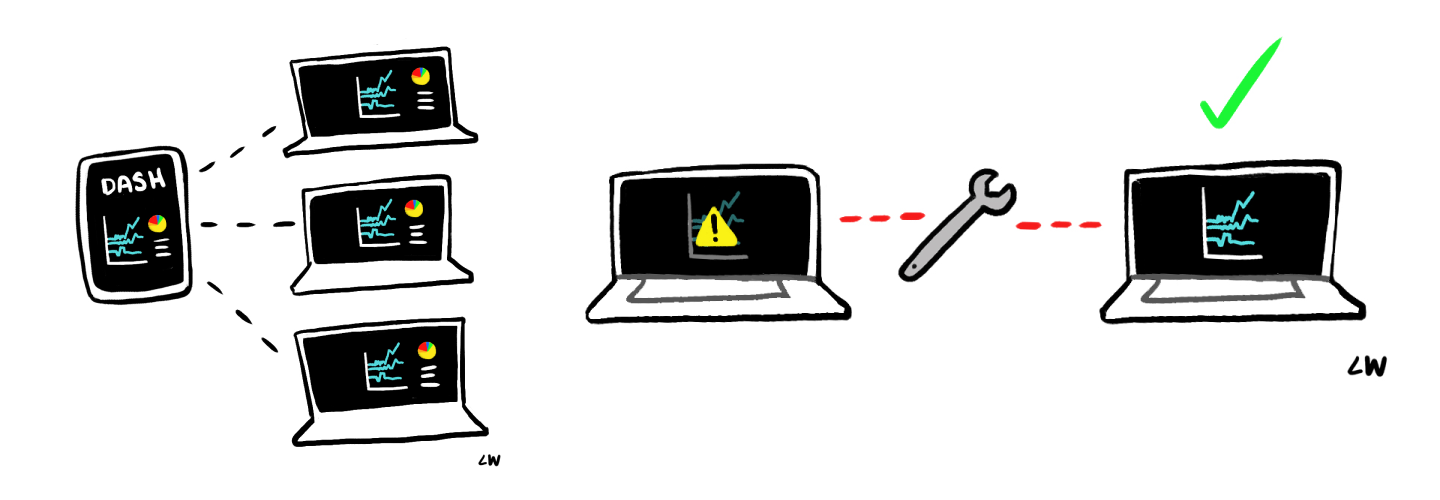
Finally, we have a fully functioning dashboard. Now we need to share it with the full audience. We should enhance the dashboard to make it more effective at scale and we need to make sure to maintain it as usage grows and changes.
Sharing
The audience will have varying levels of data literacy and context for the data presented in the dashboard. You need to verify that you have enough context within the dashboard and that you provide enough training so that people can get insights out of it easily. We go over these techniques in Sharing the Dashboard - Distribution Strategies.
Scaling
If the dashboard is useful, the amount of views and number of viewers is likely to grow. Adding links, interactivity, and documentation to a dashboard helps it accommodate more use cases and inspire other dashboard creators. Also as the number of views and viewers increases, spending time optimizing queries becomes an important way of keeping the dashboard useful. We outline the steps in Scaling Dashboards.
Maintenance
Datasources, tables, and fields change, and dashboards need to change with them. Setting up scheduled times to review dashboards is critical to keeping them relevant and functional. Providing a way for the audience to alert you about issues will allow you to make informed improvements to the dashboard. We cover maintenance in Making Sure your Dashboard Always gets better.
Written by:
Matt David
Reviewed by:
Mike Yi
