Design a Dashboard Example
Last modified: December 09, 2019
Community Story
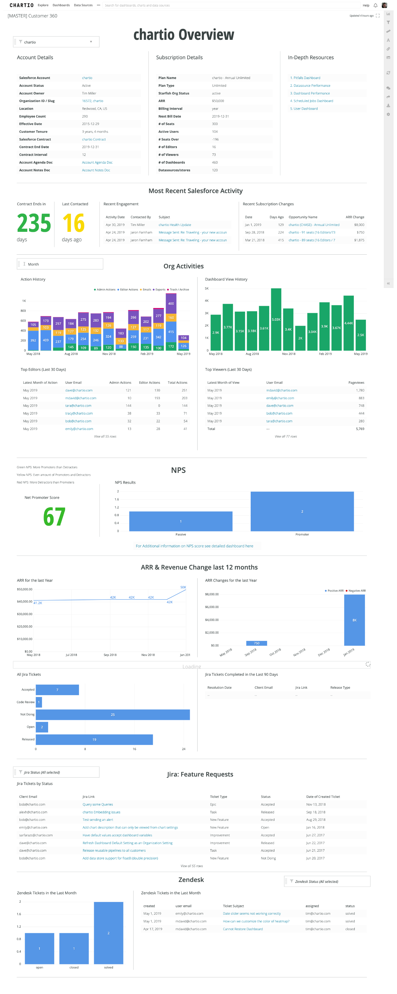
A while ago I was working with my customer success team to organize a campaign to proactively uncover 15 common usage pitfalls customers can fall into so as to educate those who’ve fallen into it, or are near it, about the best practices.
Being very good at querying and visualizing data, they had created a dashboard with a ridiculous amount of charts on it. It was an only slightly organized view of almost everything under the sun about how a customer is using us.

Because it showed too much information in a disorganized way it was of little value (not shown in the image above is 14 more sets of visualizations about our customers you have to scroll to see).
Users of the dashboard came with a specific intent - to quickly determine what pitfalls a customer may be facing. This view required them to keep in memory what each of those pitfalls are, and be able to scan a bunch of information matrix style, and see if any of it might indicate one of those pitfalls.
These types of dashboards are what happens when you start by pulling data and think about the design and organization later. It’s fun to explore and pull data, but when you do that it’s too tempting to hoard it all on the same dashboard. Dashboards like this typically look like a lot of bar charts and tables on a screen. Properly designed dashboards on the other hand tend to be a lot more succinct and dense in their data display.
Ironically we’d ignored two of the very best practices we were building this dashboard to detect - keep shorter dashboards and for important dashboards design before you build.
I saw this as a perfect training opportunity, so we got everyone together and went over the practice and importance of dashboard design - using this very use case.
The Design Exercise
First we defined how the dashboard was going to be used. We decided that it was most needed when checking in on a customer, often before one of our monthly check-ins with them. We wanted a dashboard we could quickly scan and identify where the customer might be in or near a pitfall so we could discuss it with them.
This made the decision of how to organize quite clear - the dashboard would be structured as a list of the pitfalls, with the info on that pitfall in each section. It had to be very quick to scan, and also have enough information on the issue to discuss it with the customer.
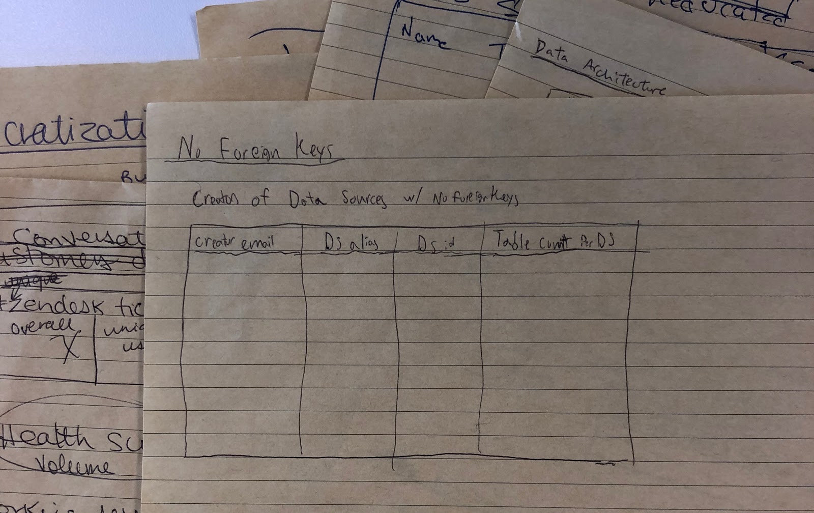
We then did something a little crazy for my team at the time - we put our computers away and we pulled out pen and paper. We divided up the pitfalls and each of us started drawing what we’d ideally have for each one.
For this example, we’ll only focus on one of the pitfalls of customers not having Foreign Keys defined for some of their data source connections. It’s very frequent that a database doesn’t have relationships defined in it’s schema, and when that happens, Chartio’s Visual SQL interface doesn’t know how to do it’s magic and automatically join tables for you - and customers have a largely deprecated experience. (Note: As of writing this we now intelligently auto-detect foreign keys so this pitfall is no longer really possible!).
The drawn mock that Tracy came up with was a simple table of some useful information on all of the sources that didn’t have foreign keys defined (thanks Tracy for keeping all your great notes!).

We then discussed it with the whole group (who in our case are also the intended users of the dashboard) and gathered feedback. The feedback was that we were very happy with how much more concise this was but that we needed one more simple chart that would let you assess more quickly how significant the issue was before having to look at the table. We also noted that the “creator email” wasn’t always the person you’d want to discuss the issue with, that the actual database id was not important but the type of database likely was.
With these edits Tracy redrew the design and then built it out. It looked like this

At this point our team was pretty excited. It was clear that this version of the dashboard was not only more concise but more useful than the pre-design versions. This made their work not only significantly easier but also more effective for the customers. They could very clearly see each potential pitfall, definitively know whether there was a problem or not, and access the information to discuss it with the customer within a matter of seconds.
Still, we had a bit more work to do. As is sometimes common in the implementation phase, some extra things that seemed important or at least easy enough to add got added. After using this dashboard for a few months we went back over and did another analysis on what was useful and what wasn’t.

We determined again that the id column would never need to be known in this use case, and that the Creator Email was an unreliable and unnecessary column as who we really needed to speak to were the data governors of the organization not the original connector of the sources. The table on the right had expanded between design and implementation to now show not just Data Sources without foreign keys, but those with foreign keys as well. The reason is that the builder thought it’d be cool to add a drill down feature where you could click the green or the red of either chart on the left to filter to the sources that respectively either had or didn’t have foreign keys. It was cool, but it just wasn’t too important.
The second chart had crept in with an attempt to not look at CSV files as a data source, but we weren’t brave enough to go all the way to fully remove the data. Instead we moved it into it’s own bar on a new chart.
With the above changes we came up with a single bullet graph that would show what percent of relevant sources had foreign keys, and have clearly marked zones of where there’s a significant issue.

We decided that the table should be sorted with those having the most queries first. We showed this as a % of all queries so you could quickly determine if it’s a heavily or unused source, and therefore make a decision on whether it’s worth talking about. The # of Tables and # of Queries were also considered valuable pieces of information for the customer conversation.

After a while of using this version, we realized that many of the data sources without foreign keys were hardly used. And that a better key metric for identifying if there’s an issue was the percent of queries that are being run on a source without foreign keys. We also realized that GoogleAnalytics and our DataStores shouldn’t count - as they’re unique and never can have foreign keys.

So we changed the bullet graph, and added a few links to more information for each database, as we found that helpful in our customer conversations.
Phew! So many iterations for what ends up being just a bullet graph and a table. And this was for just one of the pitfalls, we had 14 others. The result has been hugely valuable though, as this is a critical and highly used view into the health of a customer.
As you can see in this example, to build such highly useful dashboards involves a lot of steps and skills. To build a well designed dashboards you need a good process and a number of key skills including visualization best practice, analytical design thinking and implementation/query knowledge.
This book was designed to well organize and educate on those skills. We hope it helps you create more simple and effective dashboards so that you can help inform your organization, driving intelligent decisions and operations.
Written by:
Dave Fowler
Reviewed by:
Matt David

