Find the Best Visualizations for Your Metrics
Last modified: February 15, 2020
Selecting the best chart for your metrics is not always a straightforward process. Certain visualizations do not represent some datasets well, and certain visualizations cannot represent some datasets at all. Sometimes you just need a table, single value, or just show some text. Knowing when to use each type of visualization will help you design the most useful dashboards.
Advantages of data visualization
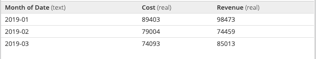
Graphs help people recognize patterns faster than looking through a table with numbers in it. For example, take a look at the table below.
Now take a look at this chart.
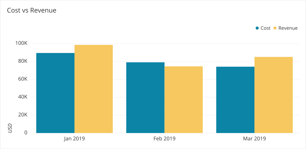
It is clear with the Bar Chart when Revenue is greater than cost and how much revenue differs across months. It is easier to draw insights than in the table, where we need to read the full number in the two cells we are comparing.
Data visualization is a general term that describes any effort to help people understand the significance of data by placing it in a visual context. Patterns, trends and correlations that might go undetected in text-based data can be exposed and recognized easier with data visualizations.
Most Common Visualizations
After studying over 100,000 dashboards at Chartio we found most data is displayed in a handful of the chart options.
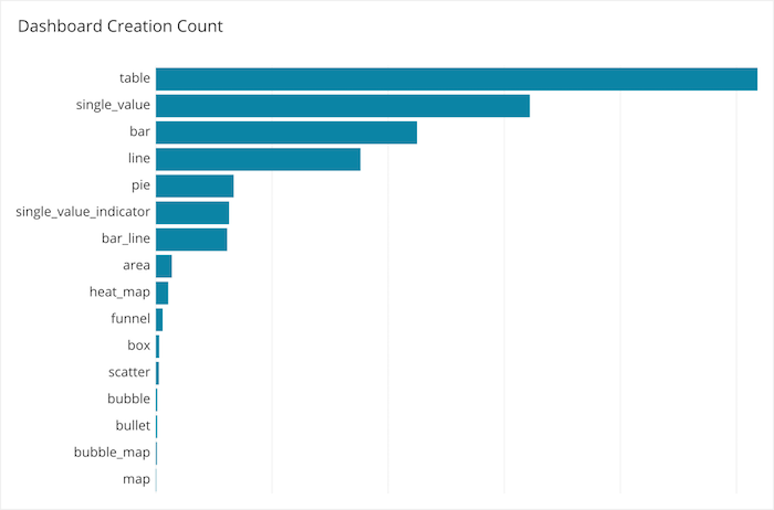
While these may not be the most optimized they are most often created. People create table views of their data, single values, bar charts and line charts.
However when we look at what visualizations are on dashboards that get the highest average views we get a different ranking.
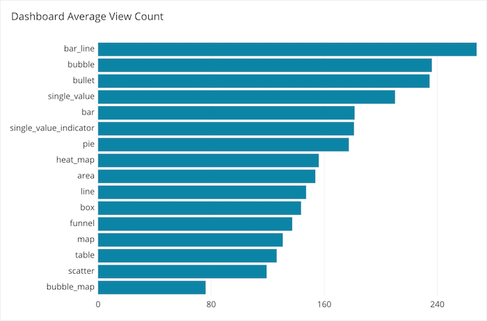
Bar Line, bubble, bullet, single value, and bar charts are the most often viewed. Consider these options before going into the more specialized types of visualizations.
Selecting Visualizations
We have created a decision tree to help you choose the most effective chart for your data. You can use this flowchart to select your visualizations. Please download this, print it out, and put it on the wall near your desk.
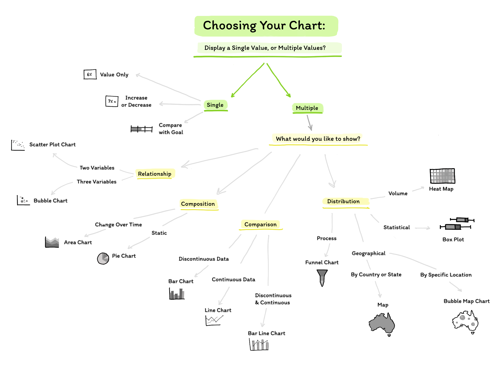
We also created a list of when each chart type is optimal to use for viewers interpreting the data correctly with more detail:
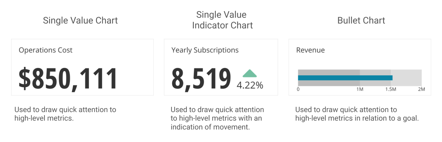
Single Value
Multiple Values
To display multiple values, there are four common categories:
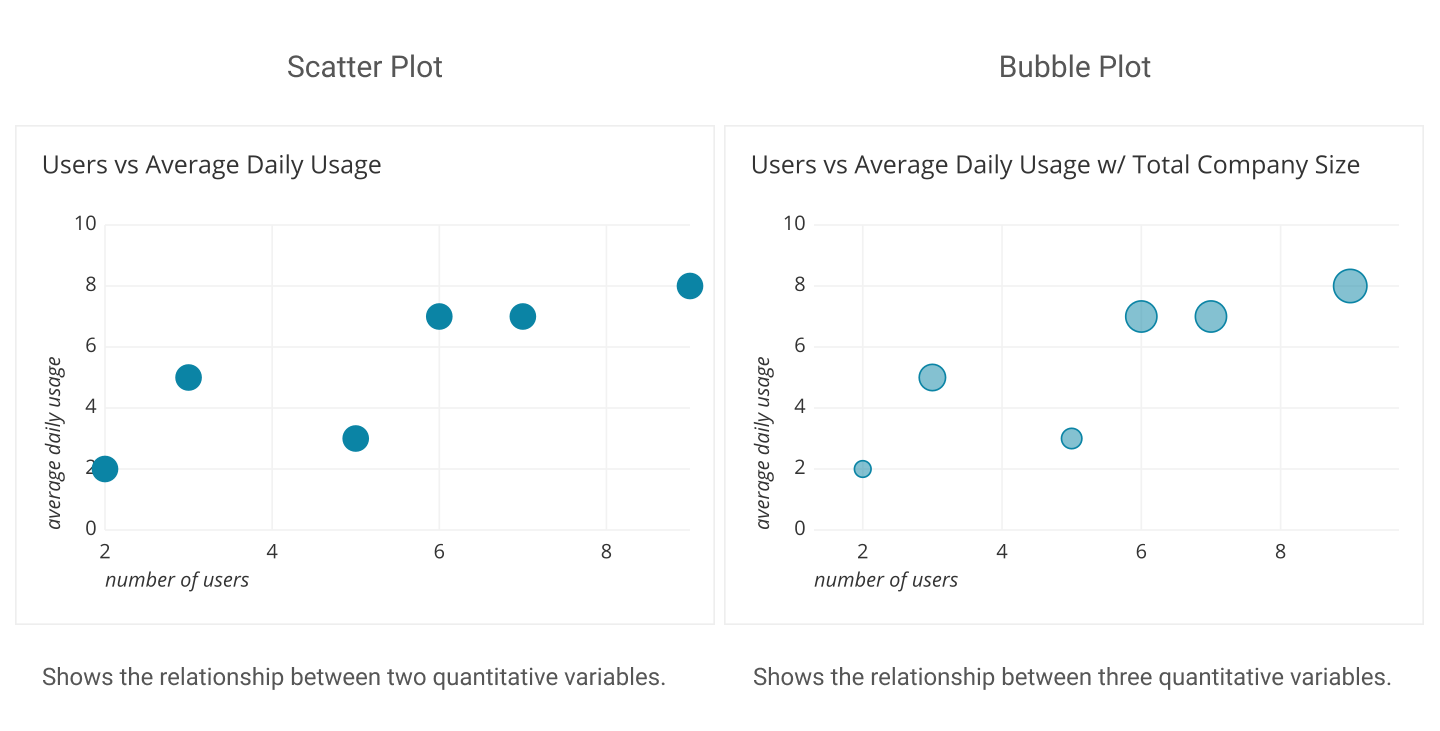
- Relationship: how multiple independent variables relate to each other.
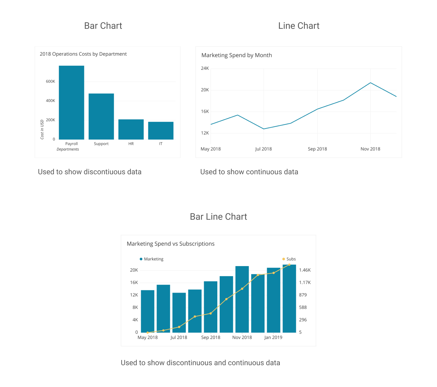
- Comparison: how two or more sets of data compare with each other.
- Composition: how a set of data is made up of smaller divisions.
- Distribution: how different sets of data are spread over a population or other distribution.
Relationship
Comparison
Composition
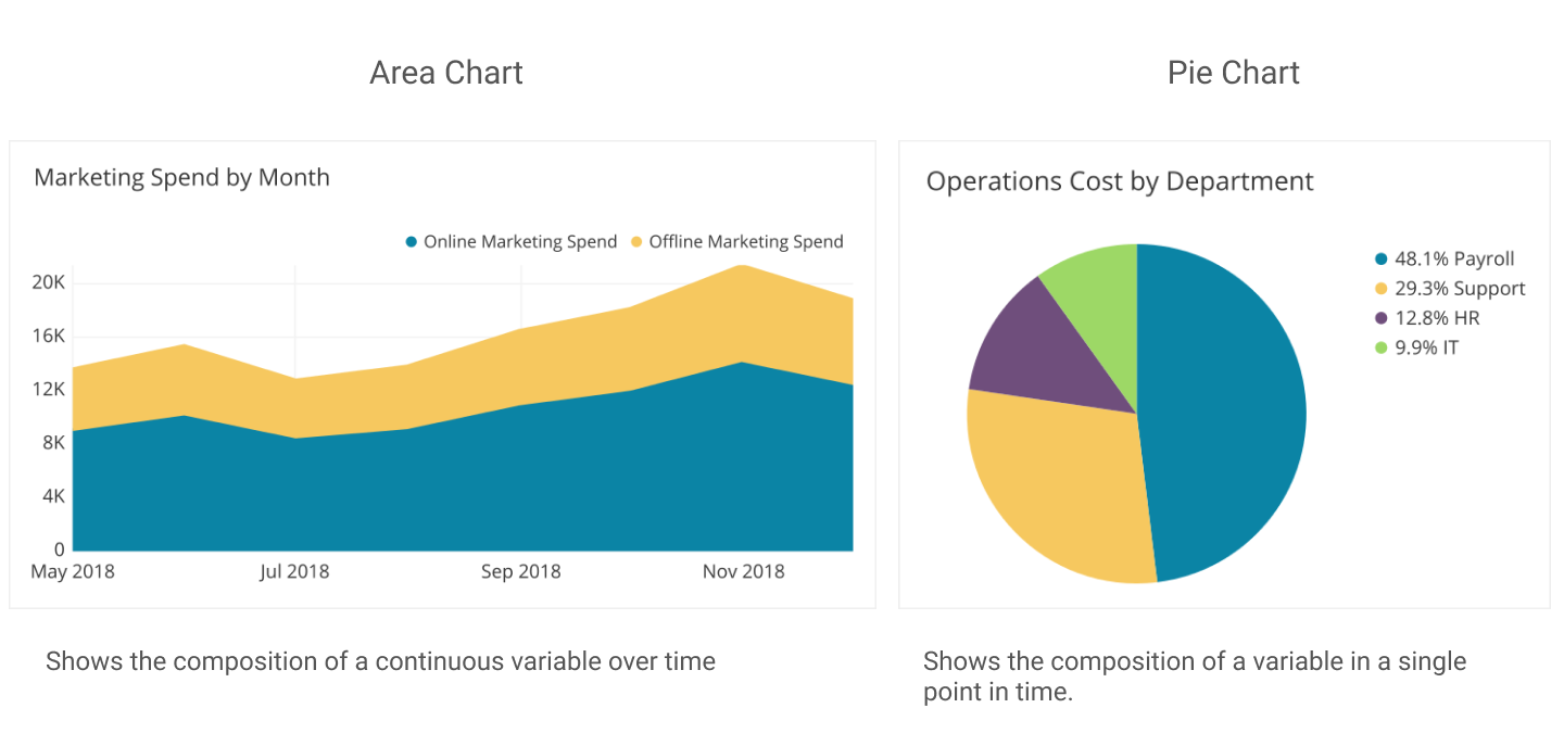
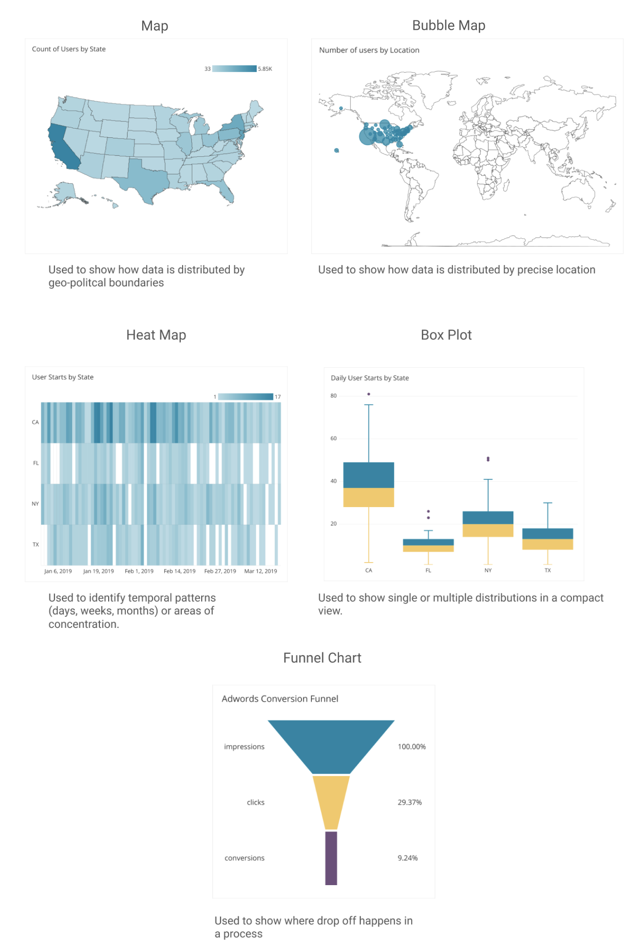
Distribution
Examples
Using the Flowchart or the more detailed list view, we can go through the decision making process for each of the metrics we created in the previous chapter. Review the formula and grouping content in the Metric Spreadsheet and lets create visualizations for each one.
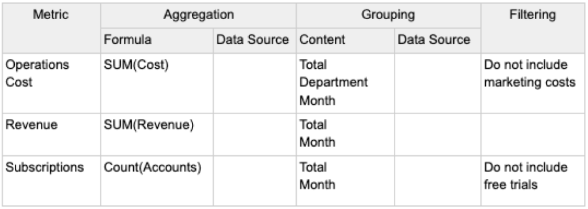
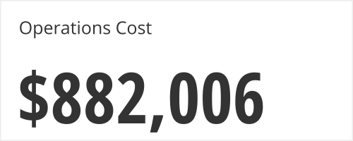
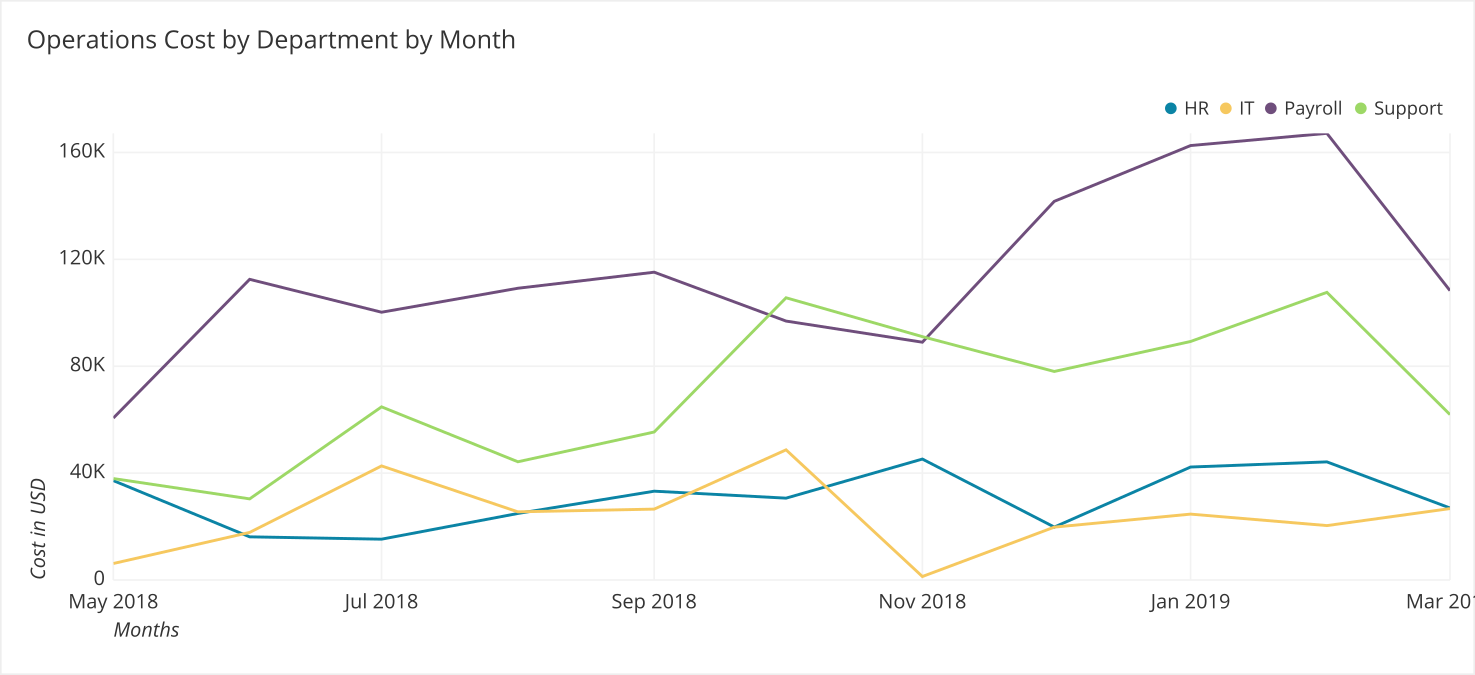
Operations Cost
There are multiple ways in which we need to aggregate operational cost. We need to calculate the total and we need to calculate the total grouped by department and month. For the total, a single value chart is appropriate. For the by department and by month aggregation, we should use a line chart.
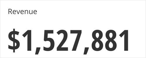
Revenue
As we identified in the table earlier, the result we need is a single value. As the Point Person didn’t leave a comment about wanting to compare it to previous periods or to a goal, the “Single Value” chart is the best way to represent the figure.
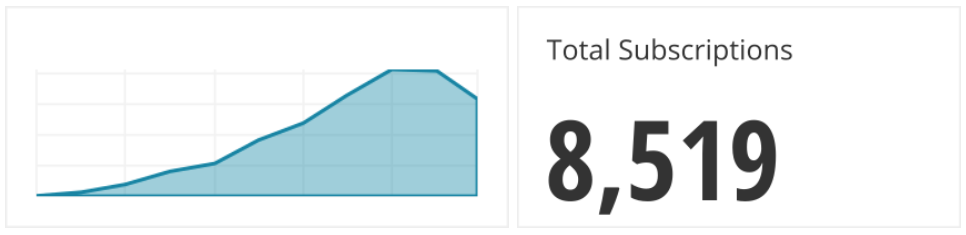
Subscriptions
We are provided with one number, but we can add a sparkline (a small line graph without axes) to give us an idea of the historical context of how the number has moved.
Things NOT to do
3 Dimensions
When it comes to comparing values, people already struggle with comparing 2D areas. For instance, all of the rectangles below have the same area.
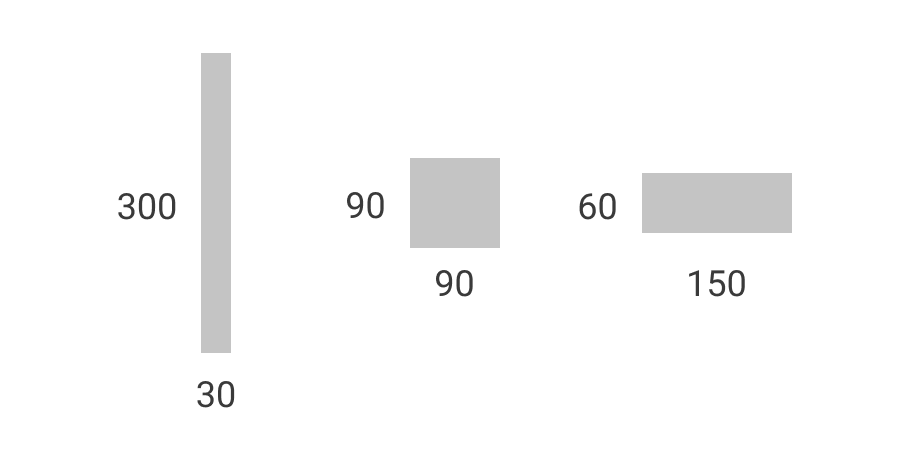
This is also why many people recommend caution when using pie charts or area charts since they leverage 2D space. They can be used but only when there are very few categories.
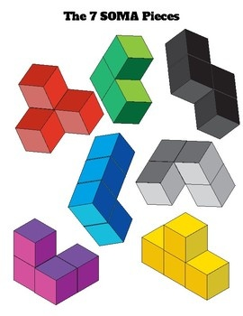
People are also not effective at comparing 3D volumes. All of the shapes below (except for the green L at the top center) have the same volume (made up of 4 cubes of the same size).
In addition, it typically requires much more space to convey 3D information than showing it in 2D. Stick with simple 2D visualizations.
Too many categories
Once there are more than 5-7 categories, it can be difficult to understand the graph quickly.
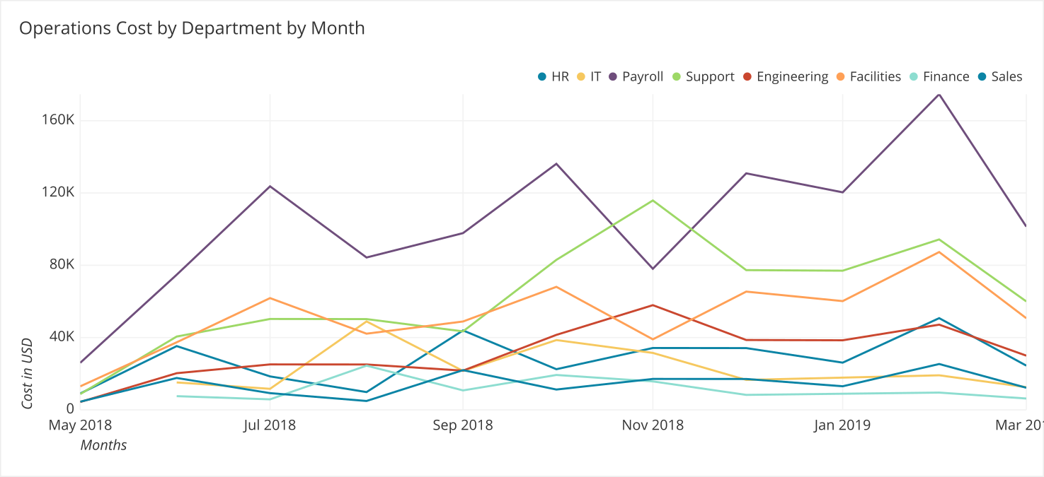
Consider limiting the number of categories shown in a visualization or try lumping together smaller categories into an “Other” bucket.
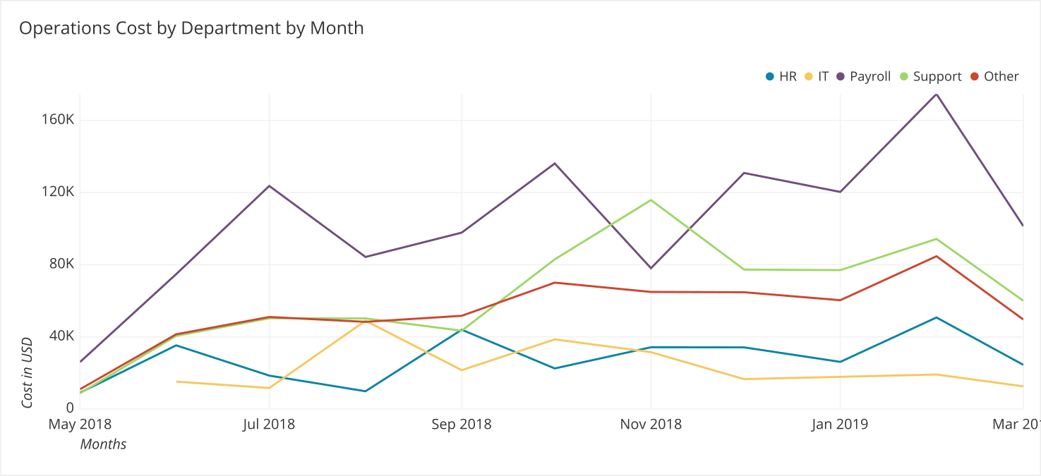
It is also a common practice to color the Other column grey to deemphasize this category, since it is a grouping of multiple categories.
Summary
- Deciding on a chart should be made based on the kind of data you have and what you want to show. Using a flowchart can help you make the best decision.
- If you are displaying multiple values, consider whether you are trying to show a relationship, comparison, composition, or distribution between the values to help you pick the most appropriate chart.
Written by:
Tim Miller
Reviewed by:
Matt David
,
Dave Fowler