Determine the Metrics to Monitor
Last modified: February 10, 2020

After defining the stakeholders involved, we need to get clear about what decisions this dashboard is going to help people with. The point of a dashboard is to help people make better decisions by giving them information and context. The Point Person will help you determine what these decisions are since they will be the main audience member using the dashboard to make decisions.
Often times the Point Person will have only a vague overall goal for wanting a dashboard. It is your job to help them refine their vision to a few key decisions that need to be made and then find metrics that will help inform those decisions. This refinement process requires a few steps:
- Understand the Motivation of the Point Person
- Focus on a few Decisions
- Define the MetricsUnderstanding the Point Person
Overall Goal
While there is a lot written about strategies for defining goals, they all boil down to the same thing: state a specific result that you want to achieve. The more specific the result, the easier it is to act on.
For dashboards this specific result will be what decisions they want to be more informed on.
Motivation
Understanding why the Point Person wants to be more informed will help us design an ideal dashboard. We can understand this by learning how they are currently informing themself on these decisions. Dig into their decisions one by one using a customer development framework:
- What is the hardest thing about making that decision?
- Why is that hard?
- Can you tell me about a time when you last tried making that decision?
- How did you become informed before making it?
- What don’t you like about your process to inform your decision?
Their answers will let us know how important the decisions are and creative ways of informing them. If it is not hard for them to make an informed decision, a new dashboard is unlikely to be valuable to them. If it is hard, understanding why making that decision is hard gives insight into why a dashboard might be the solution they need.
The story about the last time they tried making that decision will give you insight into all the different types of information they considered. If they have not tried to inform themselves in some way before making the decision, that decision is likely not very important. If they did try to get informed, then you can borrow from their current ways of informing their decision for the dashboard. Understanding what they didn’t like about their process to get informed will make sure you do not repeat the same mistake in your dashboard.
After getting perspective on the goal and motivation of the Point Person, we need to break down all of the decisions along the way to achieving their goal that need the support of data.
Define the Decisions
Best Case Scenario
Start with the ideal scenario, and work backwards. Have the Point Person imagine that they have achieved their goal and then think backwards.
- How did this happen?
- What decisions did they make in order to achieve their goal?
- What data did they have to make those decisions on?
This exercise eliminates any technical constraints and captures the aspirational decisions they wish a dashboard could support.
Worst Case Scenario
Explore the worst-case scenarios, and work backwards. Have the Point Person imagine completely failing to achieve their goal.
- How did this happen?
- What bad decisions led to this outcome?
- What decisions were made with a lack of data?
This exercise identifies decisions that definitely need data to support them. It focuses on identifying what could go wrong, so it will likely surface more practical decisions.
Prioritize
Take the list of aspirational and practical decisions and rank order them with the Point Person. While there is no hard number for the number of decisions you want to support with a dashboard, the fewer the better. This creates a focused use case and makes it easier to design the dashboard. After determining the decisions for this dashboard we need to see how we could inform those decisions with metrics.
Define the Metrics
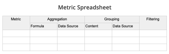
After we know what decisions are important, we need to figure out which metrics would best support those decisions. Before we talk about methods to define the metrics, let’s introduce a framework to fill out. Below is a spreadsheet that outlines all the necessary pieces that you will need to specify to create a query around a metric. We will refer to this as the Metric Spreadsheet.
A Metric Spreadsheet will help you track what the Point Person wants and help you build the final visualizations quickly. Work with the Point Person to write out how they want to aggregate, group by, and filter the metrics. If you are skilled at extracting metric formulas from business people this may not be necessary, but if you want a clear way to document their metric definitions we suggest using a Metric Spreadsheet. Either way, this book will use the Metric Spreadsheet to keep track and reference what metrics are important to this dashboard design process.
There are two approaches that can assist with figuring out the proper metrics that will support their decision making, visual and conversational. They can be helpful independently or used together.
Visual Method
Some people who request a dashboard will struggle to articulate what they need. An easy hack for this is to have them fill out what a dashboard would look like that would help them make decisions. Here is a sample template:

After they fill this out, it will be easier to talk with them in more detail about the metrics underlying in their visualizations. In the “Bringing it all together” section further down we will discuss how to dig in to each of these visualizations.
Conversational Method
After determining their prioritized list of decisions that they need to make, clarify what metrics would inform those decisions with the following questions:
- What data would help inform that decision?
- What other data might be useful to add context?
- How else could we improve this decision’s quality?
As you work through each decision with the Point Person, there will likely be multiple types of data they wish they had for each decision. The data they want to see will become the metrics that you will visualize for them in the dashboard.
Bringing it all together
After determining the set of metrics the Point Person is interested in to inform their decisions, from their drawings or through conversation, it is time to get specific about each one.
How is this metric calculated?
- Write out the formula underlying each one. For example: LTV is Average Revenue Per Customer / Customer Churn Rate
How do you want to group the data?
- Category (e.g. user type, demographics)
- Timeframe (e.g. daily, weekly, monthly)
- etc.
How do you want to filter the data?
- Group
- Timeframe
- Specific Criteria (e.g. email address, current customers, traffic source)
Push the Point Person to think about each metric in different ways to find the most valuable format. Go through the common aggregations (SUM, COUNT, AVG, MAX, MIN, etc). Discuss the tradeoffs between different statistics such as average being more sensitive to outliers than median. Talk about the different levels of aggregations and how they each would shine light on different questions.
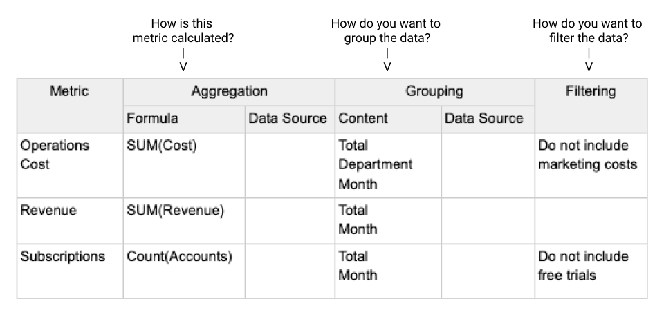
We will log all of the valuable variations of the metrics in the Metric Spreadsheet. The questions above map directly to Metric Spreadsheet columns. Here is a filled out example Metric Spreadsheet for Metrics around Operations Costs, Revenue, and Subscriptions:
Now that we have the metrics specifically defined we can start thinking about what are the most effective ways to display these metrics. In the next few chapters we will review some best practices for selecting visualizations for metrics and arranging a dashboard.
Summary
- The first step in building a great dashboard is understanding the central premise or purpose for building the dashboard.
- This understanding can be obtained by interviewing the Point Person of the dashboard and finding out the questions they want to answer.
- Then, you can work with the Point Person to define in more detail the metrics that will guide their decision making and answer their questions.
Written by:
Matt David
Reviewed by:
Mike Yi
,
Dave Fowler